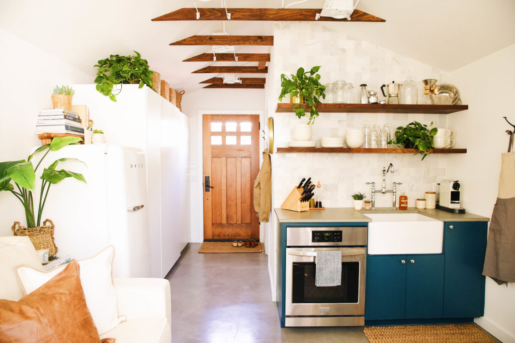
When we bought our house in November of 2016, we knew it wasn’t going to be the best for accommodating guests. Currently the house is <1200 sq ft (but not for long with a few more upcoming projects in the works), with two bedrooms and two bathrooms. You might remember from our office post a while back, that we were a bit indecisive about how we would use the space in the beginning. After making our second bedroom an at-home office space for us, we knew the garage would eventually become our guest house/extra hangout/work space. The planning started a while back and the whole project ended up taking roughly six months. A lot happened in those beginning months: we cleaned up an old chicken coup, added a shed for extra storage, purged extra and unneeded items that occupied the garage, and redid the patio near the soon to be guest house.
The contractor we worked with on this project has worked on several notable projects around town: Phoenix General/Framed Ewe: a local boutique and eyewear shop, and Palabra/Futuro where we get our haircuts and drink way too much coffee. We love those spaces and know the owners well, so we felt comfortable moving forward on such a large project with the same crew thanks to their attention to detail. Our contractor is also excellent with design, so creating a livable space under 300 sq.ft. didn’t feel so daunting. Here’s what came next: we raised the structure to level out the flooring and poured new concrete to take the best precaution incase of any water damage, relocated a few windows, removed the garage door, added insulation, a new water heater, ran new plumbing, and so much more, but let’s forget all the technical stuff for a minute and take a peek inside.
We shared a bit on IG stories when the bulk of the construction was being done, but once that wrapped up around the holidays, my sister moved into the space and it became her home for the next several months while she found her way through Phoenix. It was really special to be able to give her a home while she became acquainted with the new city and I think she really enjoyed her time while staying with us. It’s private and has a little patio off the entrance. It wasn’t until March that we really got in the space for ourselves and saw all of the work and our planning come to fruition, but we’re happy to say it has turned into a space we would be thrilled to host our parents and friends from out of town.
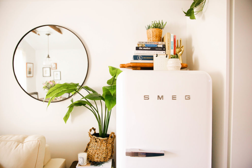
We partnered with Pottery Barn on their new line, PB Apartment, which has an amazing selection of items designed specifically with smaller spaces in mind. It was a perfect match and we had such a great time scanning their site and picking things out. Pinterest was super handy throughout the process. I think it’s hands down our favorite platform to use for home decor inspiration. We found ourselves really drawn to photographs of cottages and farmhouses in Italy…these little homes on a lot of land with many natural accents. The guest house feels very different from our main house, however there’s still many of the same elements that we tend to use when decorating in any space…marble, wood, and a pop of color.
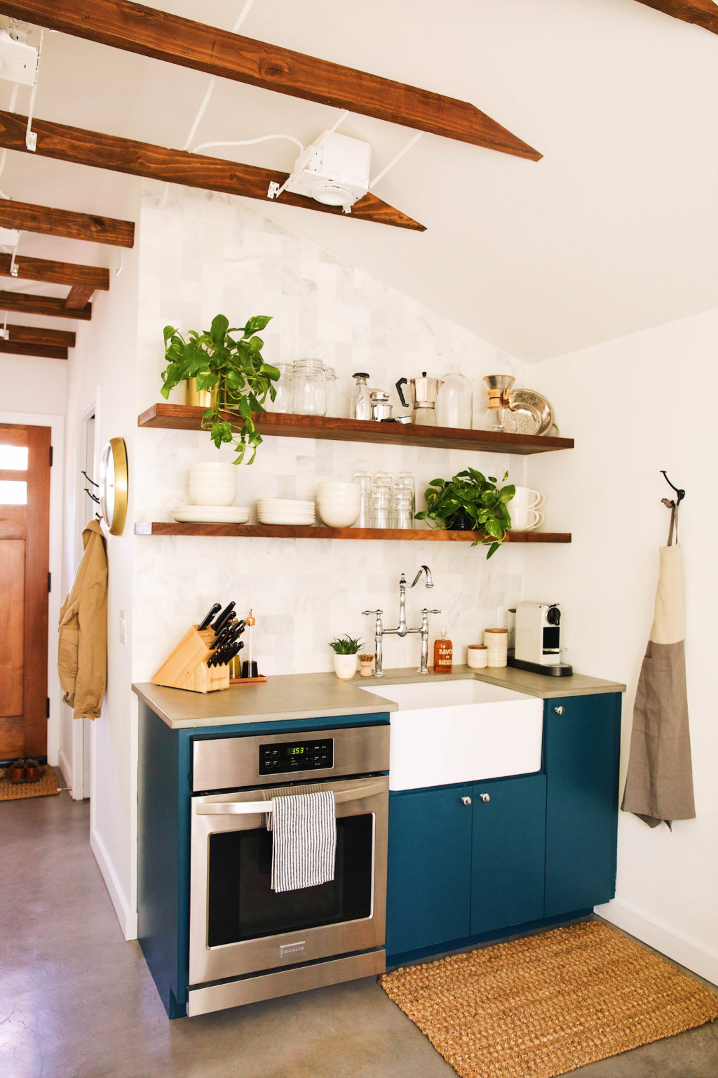
Drawer Knobs | Dinnerware | Glasses
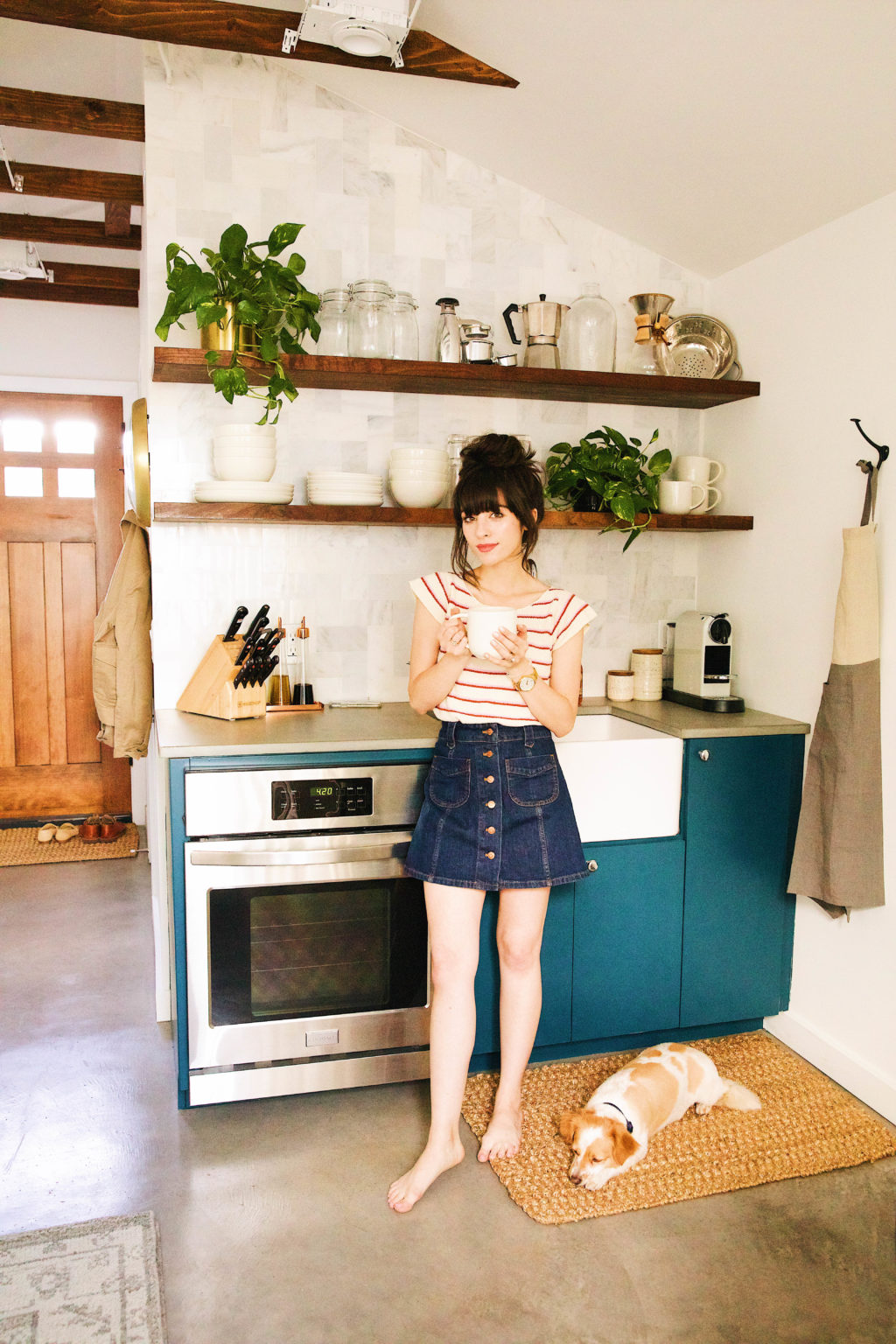
The space is small, just under 300 square feet, so we wanted to keep it mostly white for that airy and bright feel. Our boldness came in with the cabinetry, in a vibrant blue. We were immediately drawn to this color and thought it would be the perfect fit for the kitchenette with silver drawer pulls and a vintage inspired faucet.
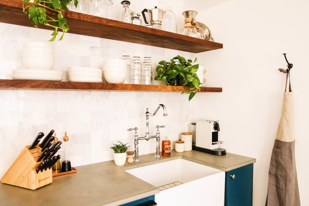

Our amazing friend, and local maker Brandon Boetto created the kitchen countertop and bathroom sink out of concrete. He owns and operates Slab Haus, a local artisan concrete studio here in Phoenix and does many commercial and residential projects all around Arizona. He is incredibly talented, kind, and really saw our vision for the space. He created the most beautiful concrete countertops for the kitchen as well as something special for the bathroom, but more on that in a bit.

The textures were so fun to play with here; we added some walnut open shelving to compliment the concrete countertops and marble tiled herringbone backsplash. The shelves are filled with Joshua Dinnerware, a rustic vintage inspired glazed collection from Pottery Barn that fit perfectly in the space. We also added a few espresso pots that are very dear to me on the top shelf. They belonged to my great uncle and I love how they double as decor and are ready and waiting for anyone who may want to brew a cup. If our guests are in a hurry, we added a Nespresso maker for good measure. 😉 Of course an open shelving vignette of ours wouldn’t be complete without a few hanging plants.

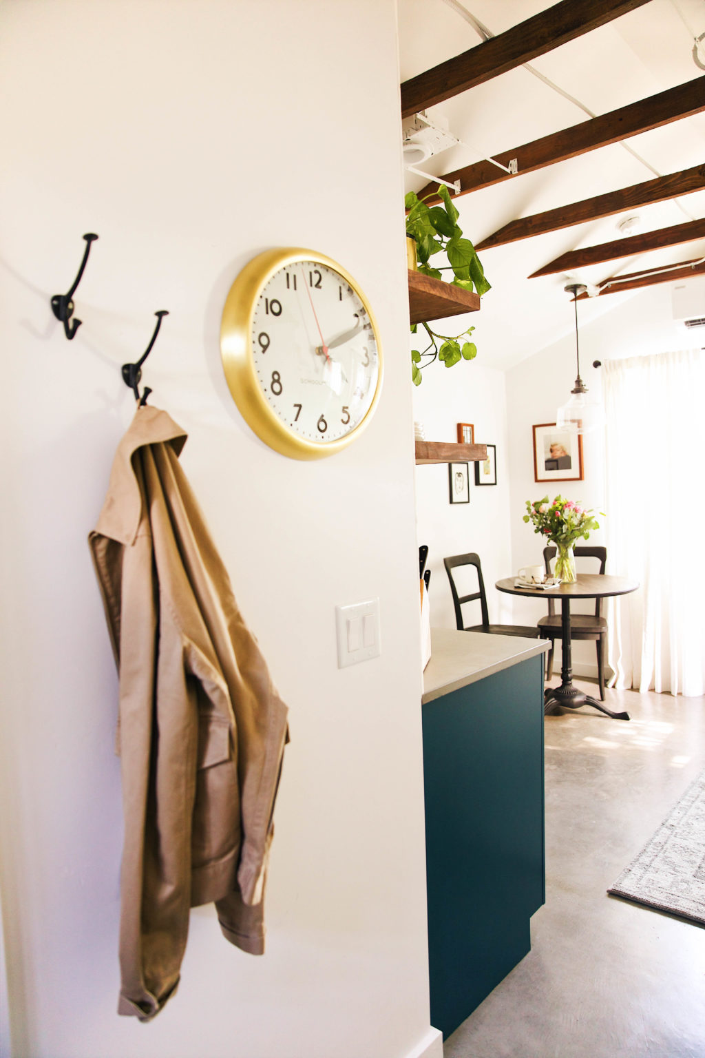
Dining Table | Chairs | Pendant Light
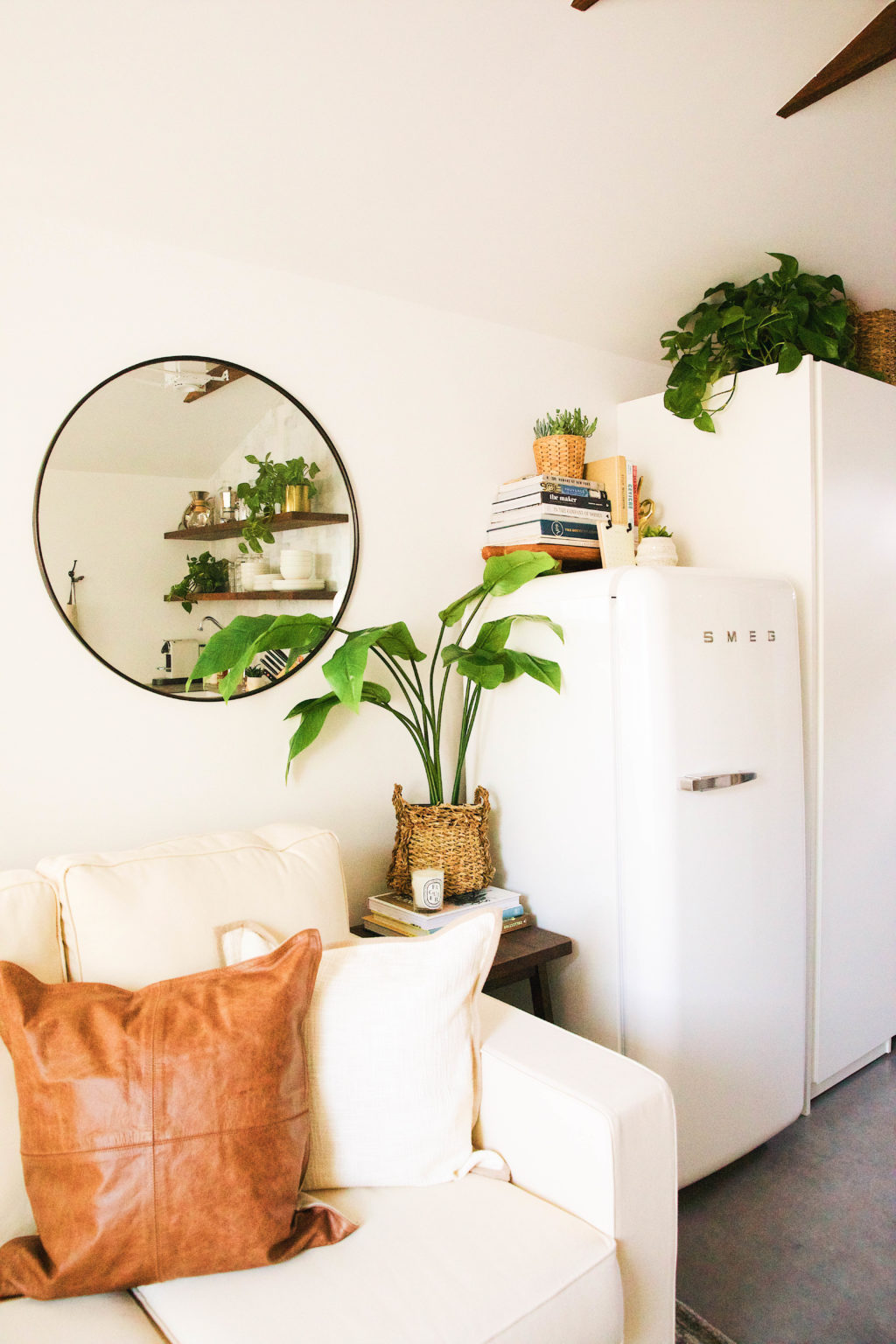
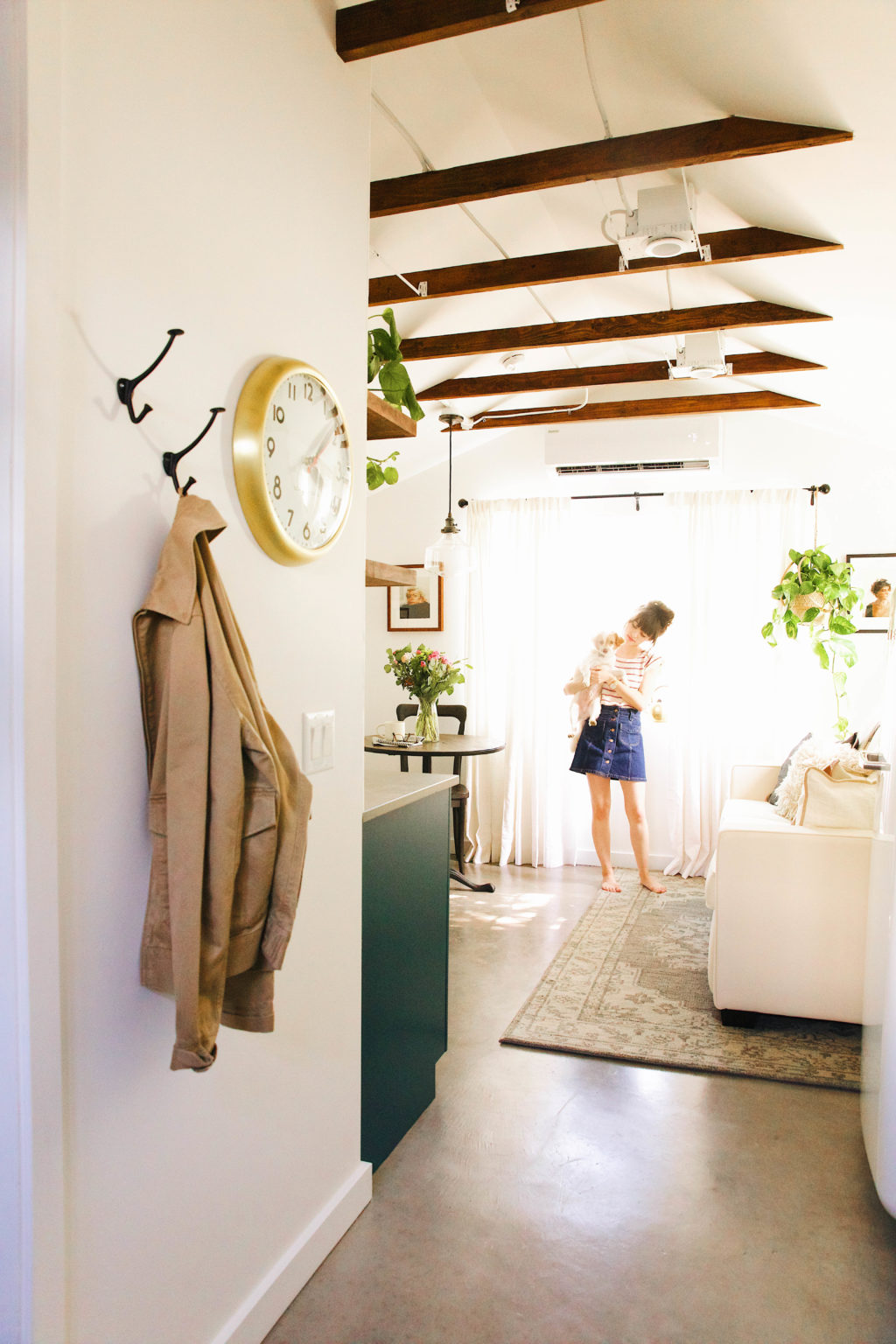
We kept the dining area super simple with the Rae Bistro Table and Cline Dining Chairs from PB Apartment. They fit perfectly nestled in the “dining area” for meals and then we can push the chairs in the corner when opening the sleeper sofa in the evenings. We had thrown around the idea of a Murphy bed for space saving purposes, but really wanted a comfortable space for guests to hang out during the day, other than at the dining table. So many people advised against a sleeper sofa, but we have been living in the guest house for about a week now (during our home renovations) and haven’t had any issues at all. We love the functionality it adds to the space and have been feeling well rested each morning. We went with the Cameron Sleeper Sofa from PB Apartment, but love this leather option too. We probably would have went for this one if we weren’t tight on space. 😉

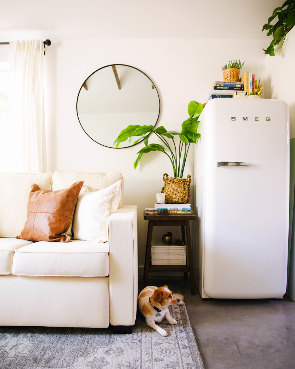
Rug | Fridge | Sleeper Sofa | Side Table | Mirror
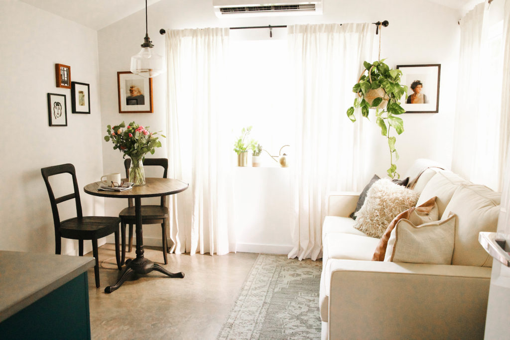

All the windows help keep the space bright and cheery. Simple curtains with a contrasting curtain rod felt very European to us and I love the linen texture of the drapes. Even when drawn, they don’t make the tiny guest house feel cramped or closed off.
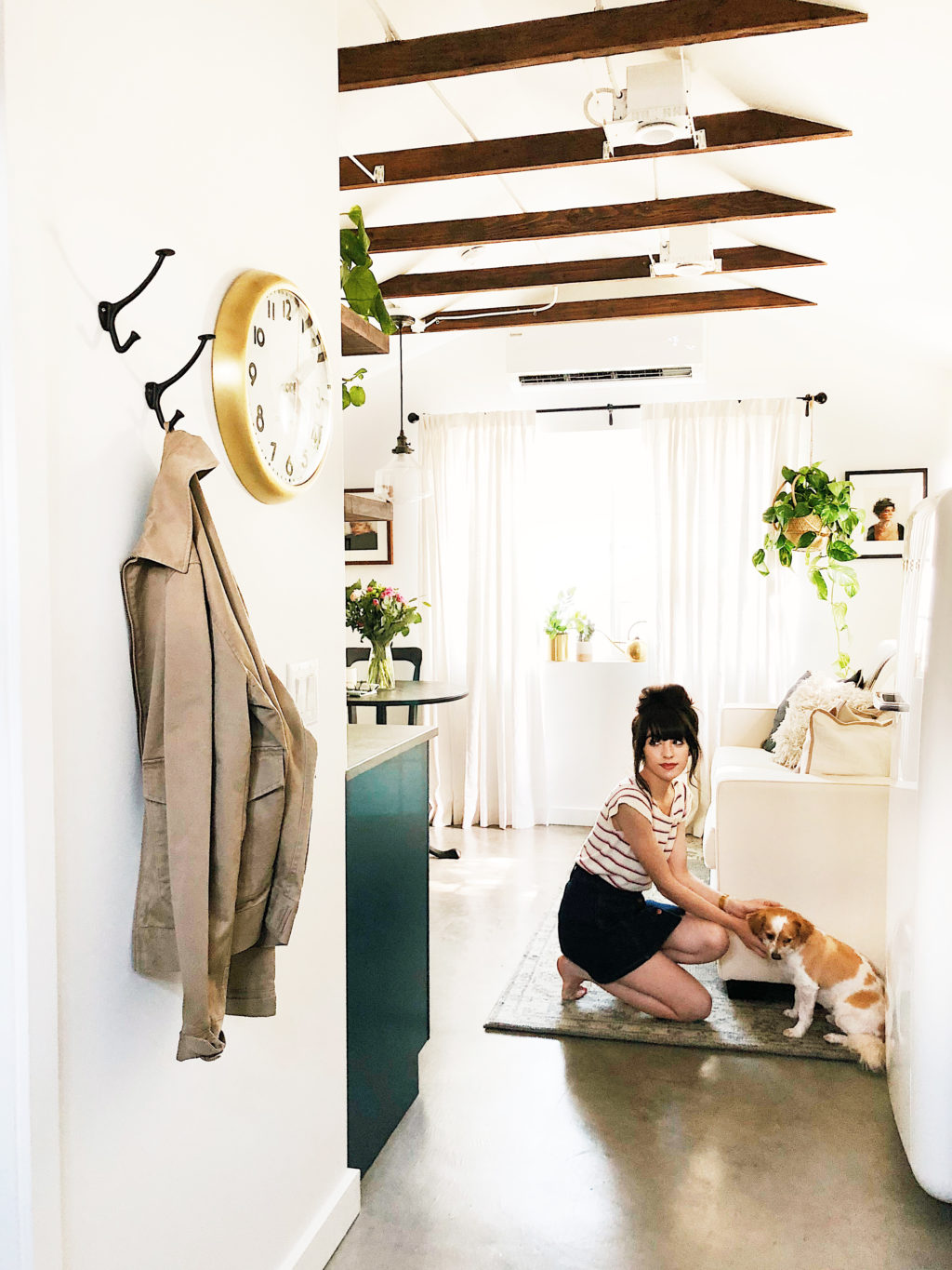
We started this project before we really dove into the plans for expanding our main house, so extra storage was a priority for us and for our guests. We added two wardrobes (with sliding doors — that is a big thing we learned with this project, sliding and pocket doors are your friend!) deep enough for luggage and a vacuum/cleaning supplies, etc. and several baskets on top for small odds and ends.
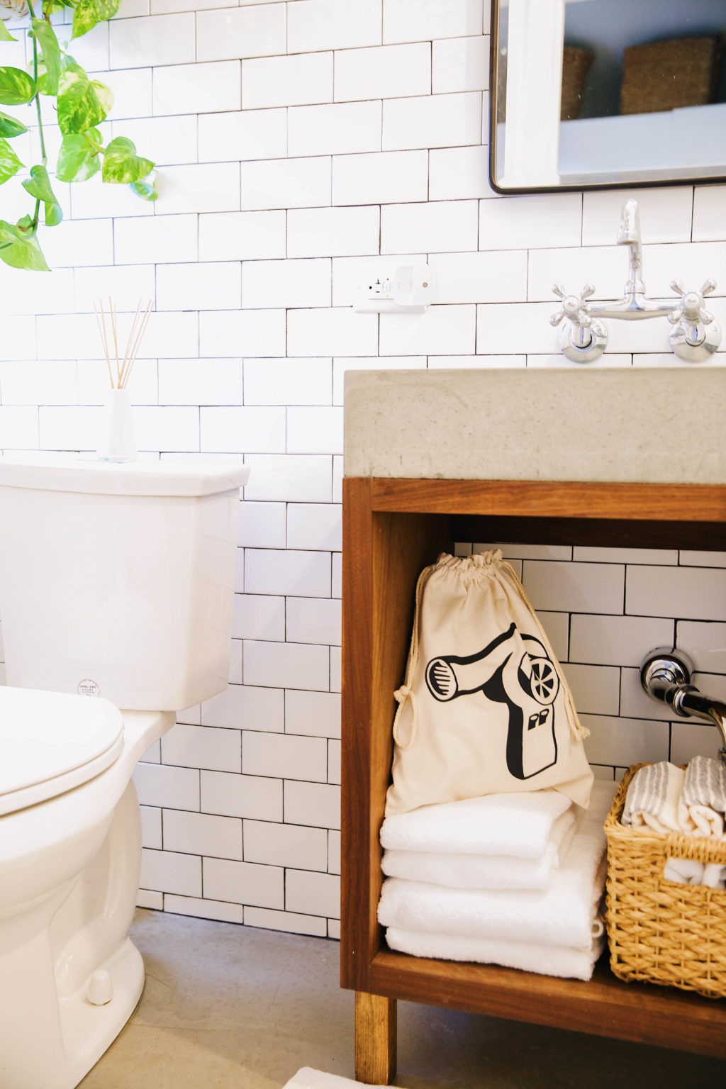
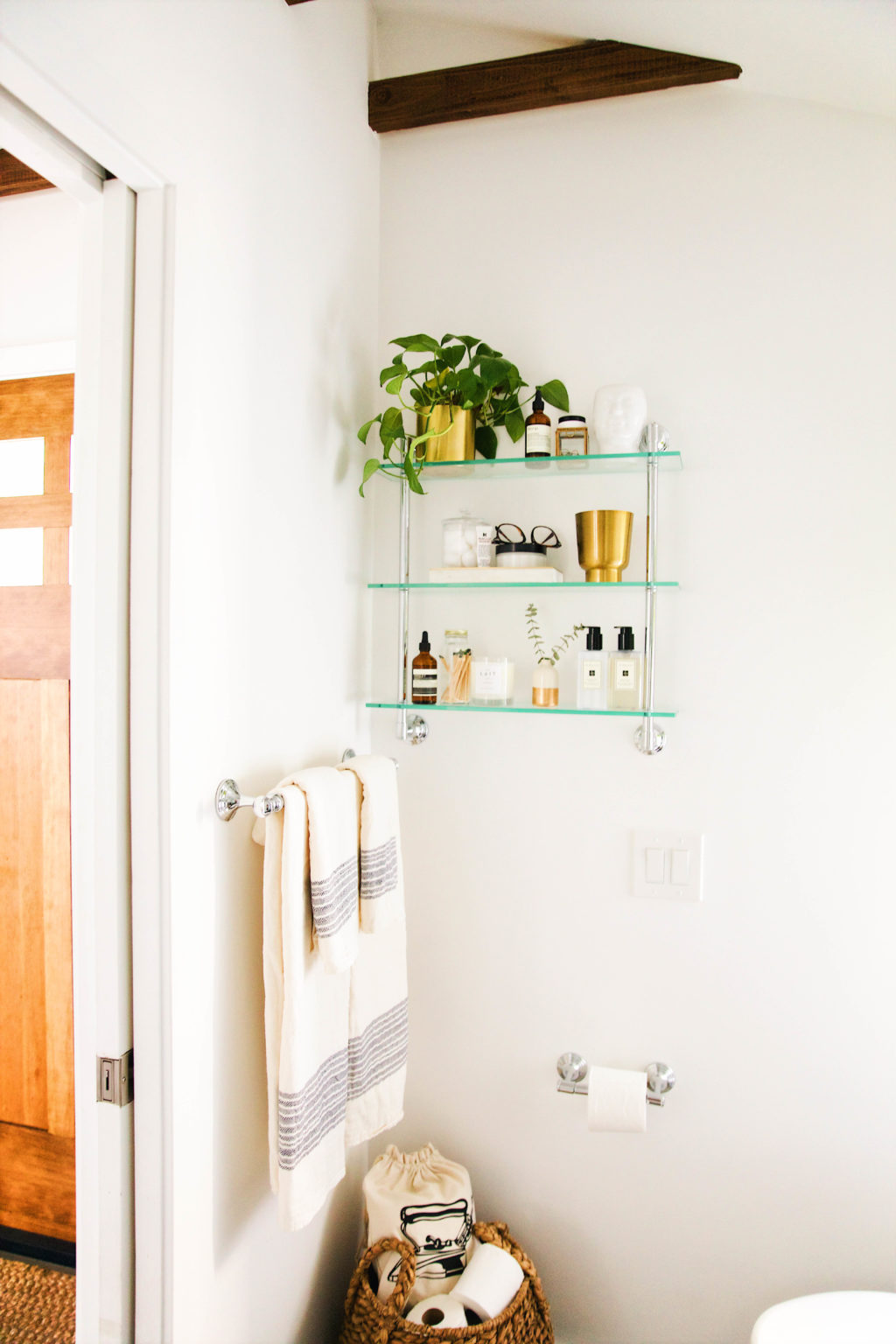
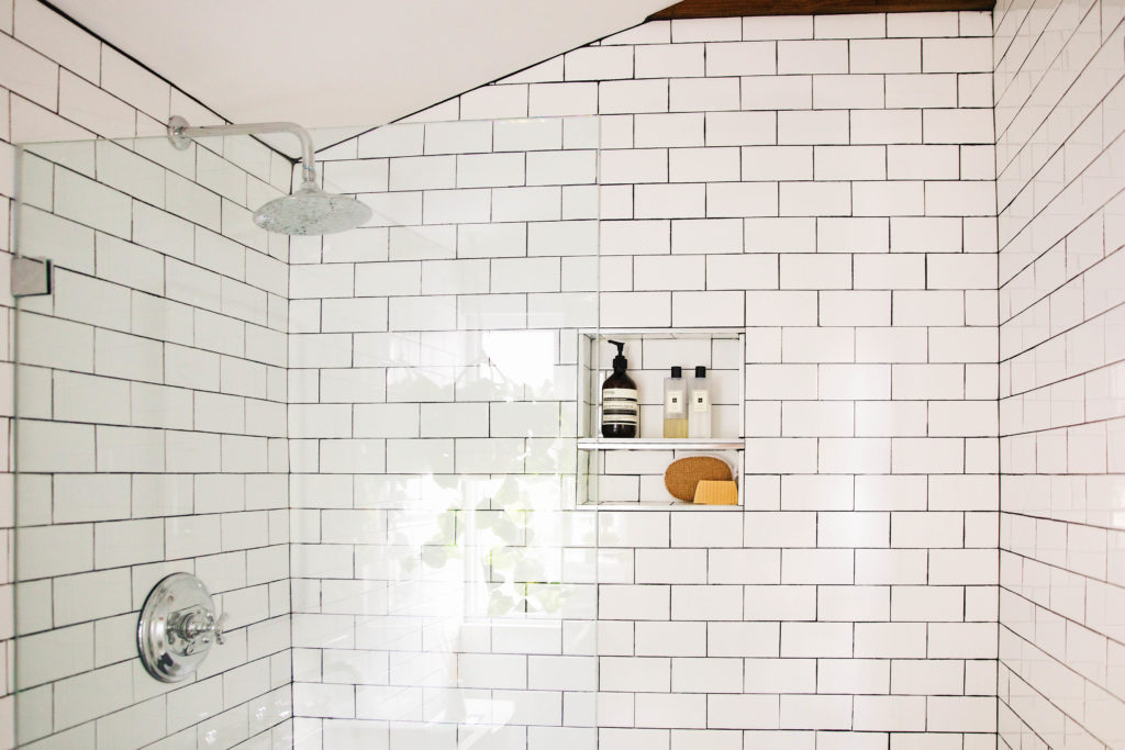
Shower Head | Sink Faucet | Towels
The bathroom was a big priority for us. We wanted to make sure guests didn’t feel cramped when showering or as though they would knock something over while getting ready, so we went with a standard size shower, medicine cabinet for storage, extra open shelving, and baskets and totes for odds and ends like a blow dryer and iron. We love the look of the chrome with the wood accents and concrete sink. It really just keeps everything feeling fresh. Looking forward to sharing more small space solutions and a closer look at this area in a future post.
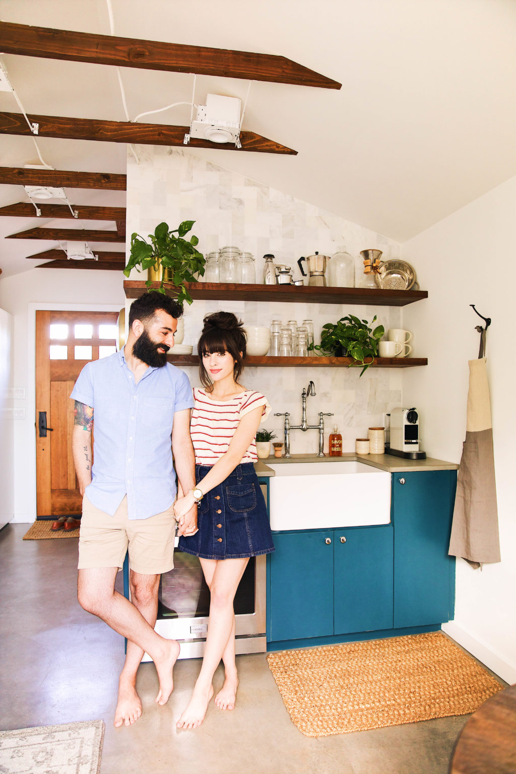
Well there ya have it! Our guest house has really come a longgg way from its garage days (see below). We couldn’t be happier with how it turned out and are all ready for guests, but first we’ll test it out while our main house is getting worked on. 😉 Looking forward to hosting friends and family here real soon!
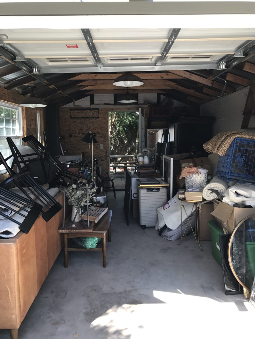
What do you guys think? Do you have a small space, apartment or home that you’re designing? Would love to hear what has worked for you or not, as well as any questions about our process! This was such a fun project.
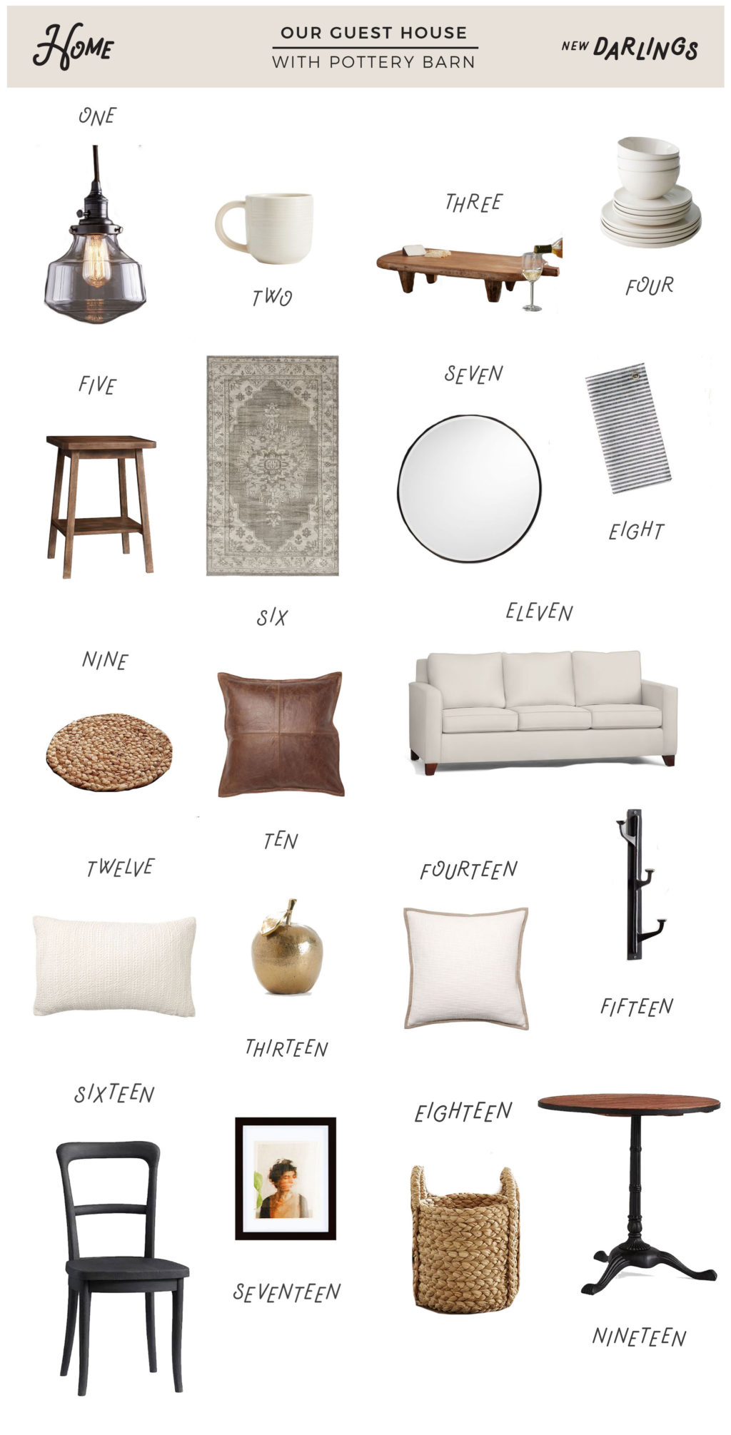
1 | 2 | 3 | 4 | 5 | 6 | 7 | 8 | 9 | 10 | 11 | 12 | 13 | 14 | 15 | 16 | 17 | 18 | 19
Shop the post:
Stay tuned for a closer look with a video tour of the guesthouse, coming soon to the blog!


We’ll take it! When do we move in?
You guys are welcome anytime…well after we move out of it, of course. 😉
Seriously, such a beautiful space. My husband and I have contemplated a tiny home on and off, but we have a 3 year old that we are not sure how the logistics would work with that. Definitely possible though. Thanks so much for sharing y’alls progress and finished product. I feel like my family and I can take on a fixer upper for sure.
Hi,
Where can I get the glass bathroom shelf? This is amazing btw.
You guys did an amazing job! Love all the wood beams and concrete countertops!
Beautiful space! Nice work guys 🙂
Wow your guest house is amazing! You guys did a great job, and I especially love the pop of color you chose for the cabinets! I love all of the wood elements too in the door, beams and shelves.Everything looks so good!
I’m not usually the biggest fan of the color blue, but that color on the cabinets is gorgeous! This whole space is beautiful!
Same here! We just gravitated towards this color though. Haha Thanks so much for checking it out and for the kind words. 🙂
Would you be willing to share the blue color on your kitchen cabinets? My kitchen walls by the coast needs this color. It is currently navy, but this blue would be stunning!
I’m curious why you chose to go with an oven, but no stove top? Do you have a hot plate in there or similar to use? Would love to see some more detailed posts. Also it looks great. You should consider AirBnBing it!
We ended up going with a small oven that is really a wall unit oven. To save space (because there’s limited counter space) we went with an induction cooktop that can be easily stored in a cabinet and then pulled out for when guests want to cook. When we originally planned the space we had no idea we would be living in it for six months, so a long term stay wasn’t in mind while designing. However, so far so good over here. 🙂 Definitely going to share more detailed posts. Thank you!
Share the link for the blow dryer and iron bags!
They’re from Ace Hotel. Here ya go: https://bit.ly/2IcuPjO 🙂
Where did you get the artwork?!
Who is your contractor?Planning on remodeling our house in the future so we are looking for a good one
This is gorgeous! Where are the wall shelves from for the kitchen? Love the color of the wood
Thanks so much Ariana! Our contractor and his team made them, then they were stained with Special Walnut stain. 🙂
This space is beautiful! Could you share where the glass bathroom shelf is from?
Thank you so much. It’s from Pottery Barn as well. 🙂 Here’s the link: https://bit.ly/2GpQ4Jb
Hi! Can you let me know where the white wardrobe/storage cabinets are from? I have a renovated space thats about the same space and in need of storage. Thanks!
What did you use in the floor? Was it already finished? What kind of stain for the concrete?
Hi! What is the blue cabinet color in the kitchen?
WOW! what a transformation. looks amazing!
I love everything about this, especially the blue cabinets! Do you mind sharing the distance between your open shelves? We are in the process of installing them in our kitchen.
Hello,
I can’t thank you enough for creating such a beautiful blog. It’s helpful for me when looking at design and right now I’m remodeling my basement. Like Jess, I would love to know more about the floor in guest house. Did you apply a specific coating?
What finish did you select for the PB Apartment Cline chairs? It looks dark, but like there’s some warmth, which is nice.
Love the whole room though!
Thank you! We went with the charcoal color. Honestly, you can’t go wrong though – all the stains are really pretty.
Hi, I was curious on where you purchased the wall clock in the guest house?
It’s from Schoolhouse Electric. 🙂
Where are the cute drawstring bags for the iron and hairdryer from?
Hello, this looks amazing! I also live in a historic Phoenix neighborhood! Quick question, how did your contractor raise the structure and take measures to prevent water damage? I am currently remodeling my casita and have found evidence of water intrusion. I’d like to find a solution to this issue before I go any further. Thanks! 🙂
Hi, I love your kitchenette design. Can you share where you purchased the base cabinets and sink?
Thank you! The cabinets were built by our contractor, Loyal Design Co. and the sink is from Wayfair. 🙂
The space looks amazing! Can you share the backsplash tile maker and name of it? Thanks so much!
What’s the paint color on the cabinets? Thanks!