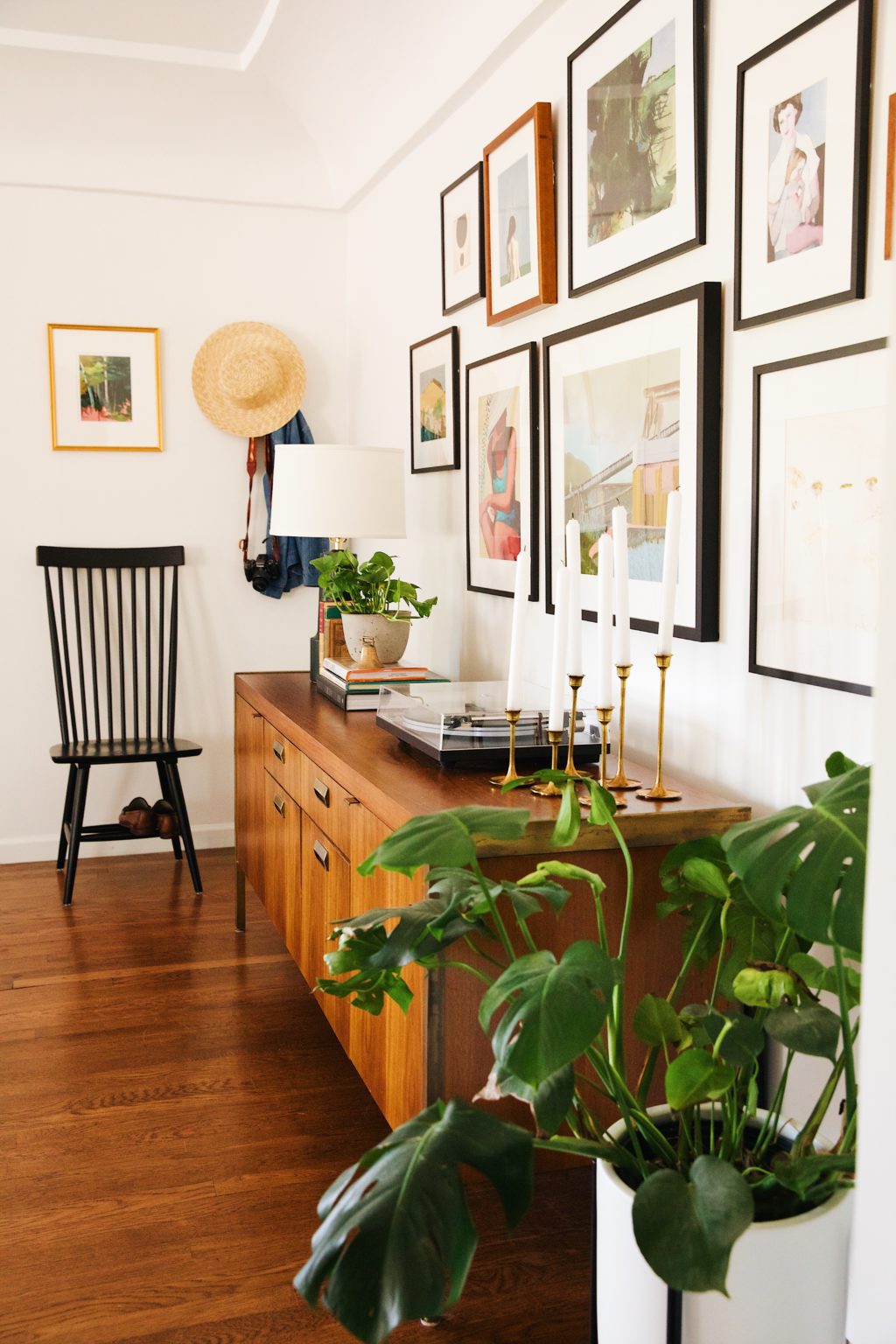
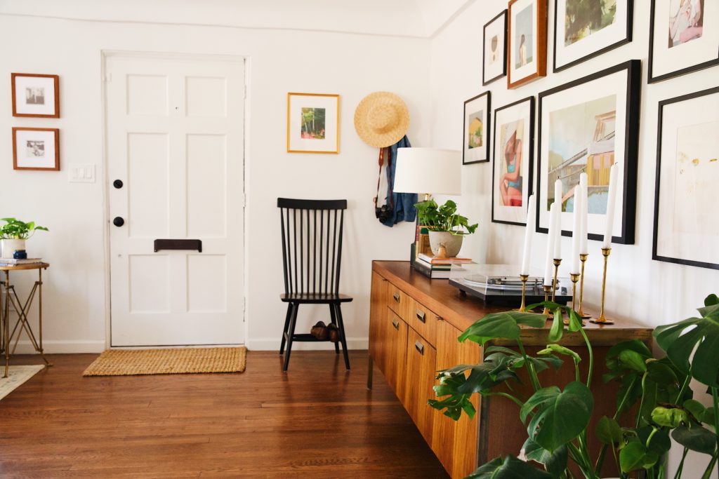
Ahh, the entryway…where you kick off your shoes, throw down you keys and mail and leave the day behind you before stepping fully into your home. Some floorplans don’t necessarily have one, and our house was one of those floorplans. Our little 1930’s Tudor is cute, but when you first walk into our home, you immediately step into the living room. Not exactly ideal for creating a nice flow or keeping odd corners tidy. As we mentioned in our living room reveal post the other day, the room is a large rectangular shape opening up to the dining room and kitchen. We didn’t realize it at first, but not having a defined entryway/foyer made placing furniture a little tough. We wanted to make sure that whatever we put in this area had purpose and character. To do so, we decided to divide the room into two sections and create a clear living/conversation area and a faux entryway.
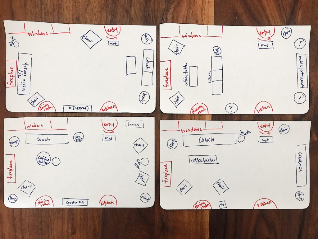
We originally were going to keep with the same design layout the previous owners had (top left sketch above) minus the TV/media unit infront of the fireplace. We thought about maybe putting two accent chairs where our credenza now is, but we played around with a few layouts before we felt like we got it right. Here’s a peek at those above with some very quick, not exactly to scale sketches of ways we moved our furniture around, but it helps ya get the idea. 😉 We love the two archways that lead to the dining room and kitchen, but those openings really dictated certain furniture pieces and the flow of the room. Decorating the wall between them was questionable for us too.
Entryways typically have a few key pieces: sideboard or console table, hooks/coat rack, a bench/chair, a mirror or artwork, and rug/mat. We’re obviously simplifying things here, but breaking down the decor elements in a room has always been interesting to us. There’s definitely a formula for most spaces, a check list of sorts that makes “figuring out” a room a bit easier.
CREDENZA
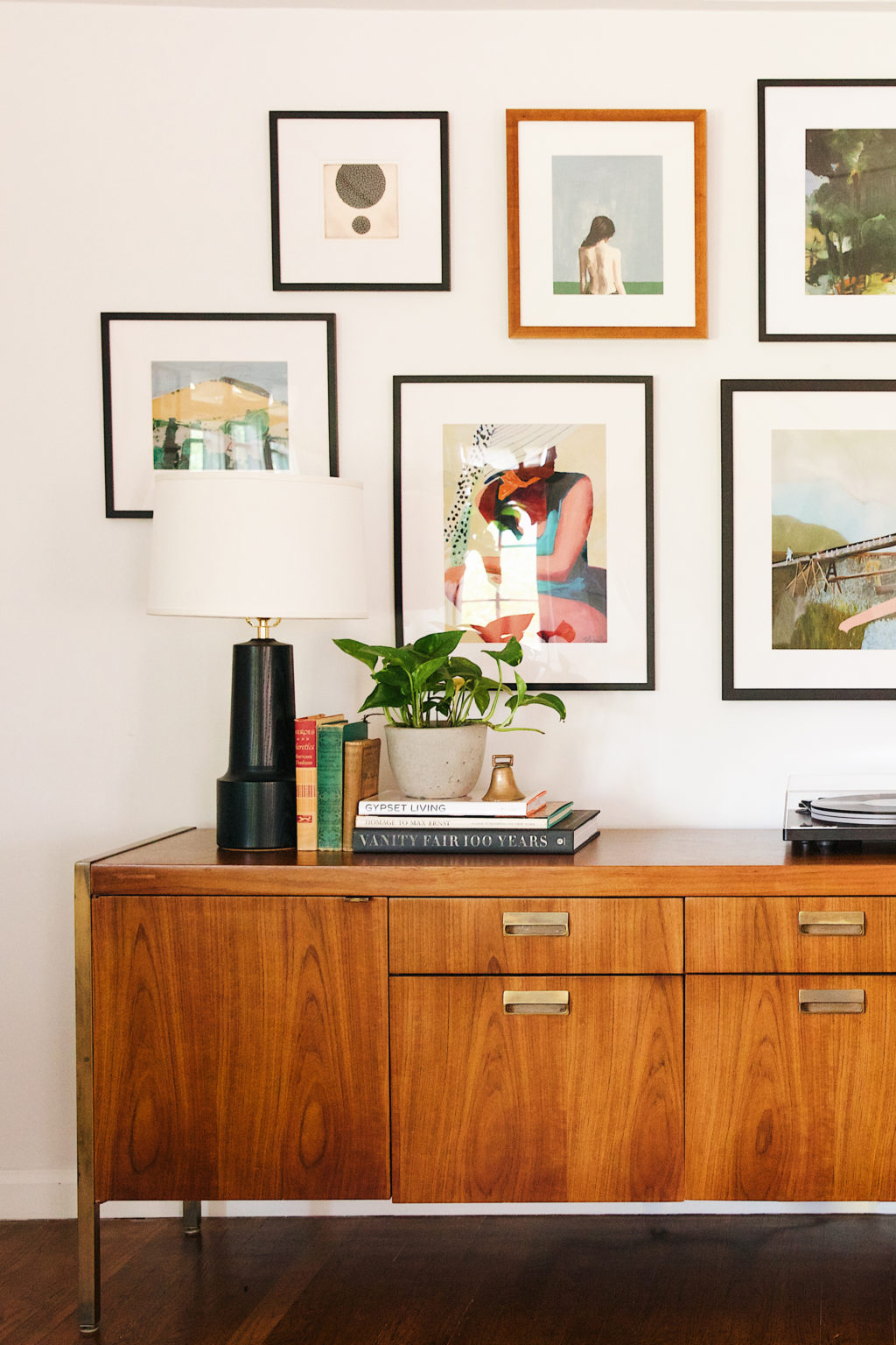
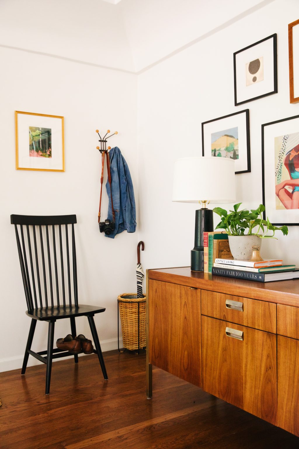
So what’s first? The credenza, side board, console, whatever you may want to call it….we found this beauty at Modern Manor, a local vintage shop when family were in town. We were showing them some of our favorite antique stores and we found this piece on a whim. It’s solid wood with all original brass hardware and we fell head over heels for it. It gave the room some much needed warmth. As much as we loved our West Elm credenza, it was just a bit too small for the new space.
HOOKS
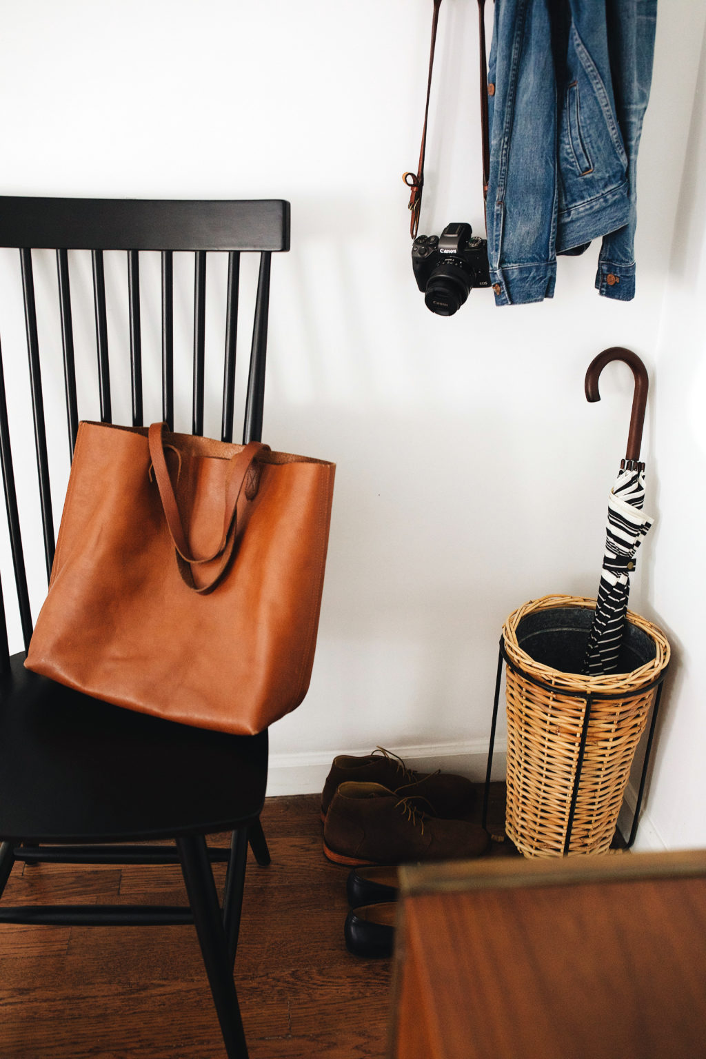
After seeing and admiring so many similar style coat hooks while on our Scandinavian cruise, we thought we should just go for it. It’s a nod to the Eames design which we have loved and you really can’t go wrong there. We originally wanted a coat rack to add some height to the side of the credenza, but cute coat racks are hard to find. Plus, it wouldn’t really be used many months out of the year. This fun hook from Schoolhouse is the perfect catchall for light jackets, hats, bags, keys, and our camera. Everything is right there and easy to grab before heading out the door.
SEATING
We’re suckers for chairs. We currently have several vintage ones in our garage that we’re saving for the guesthouse remodel, but this Windsor style one was just what we were looking for in our faux entryway and super affordable. If our door didn’t open directly to this area we would have opted for a bench, but we think this option turned out pretty nicely. The higher back balances well with the hooks and basket nearby. Stool, bench, chair, whatever you have room for, we all need a place to put on our shoes. 😉
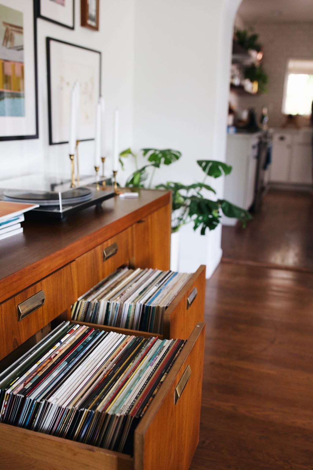
STORAGE
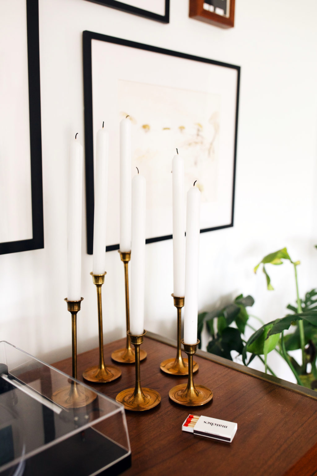
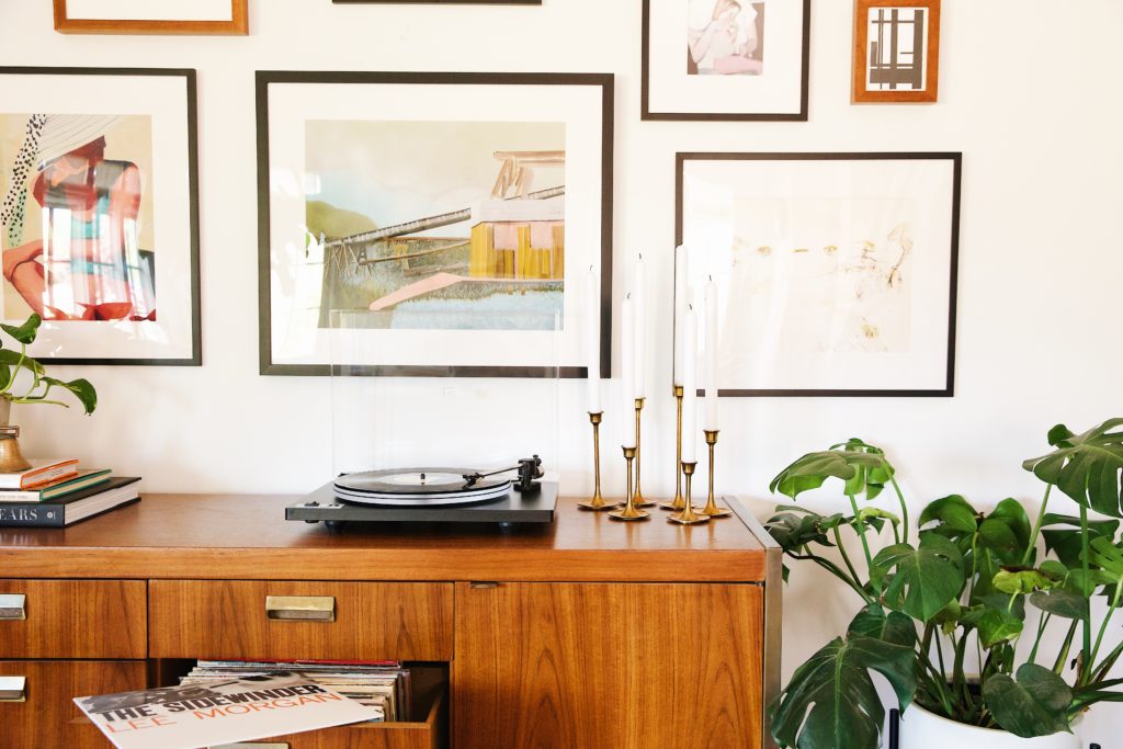
Whether its baskets, shelving, or a sideboard, storage is always needed in the entryway. Books, a flashlight, candles, gum, spare lightbulbs…I feel like there’s always something being stashed away in there. Our credenza cabinets and bottom drawers double as our record storage. They surprisingly fit perfectly. The smaller more shallow drawers house Henry’s leash and harness for easy access before heading out for his walks.
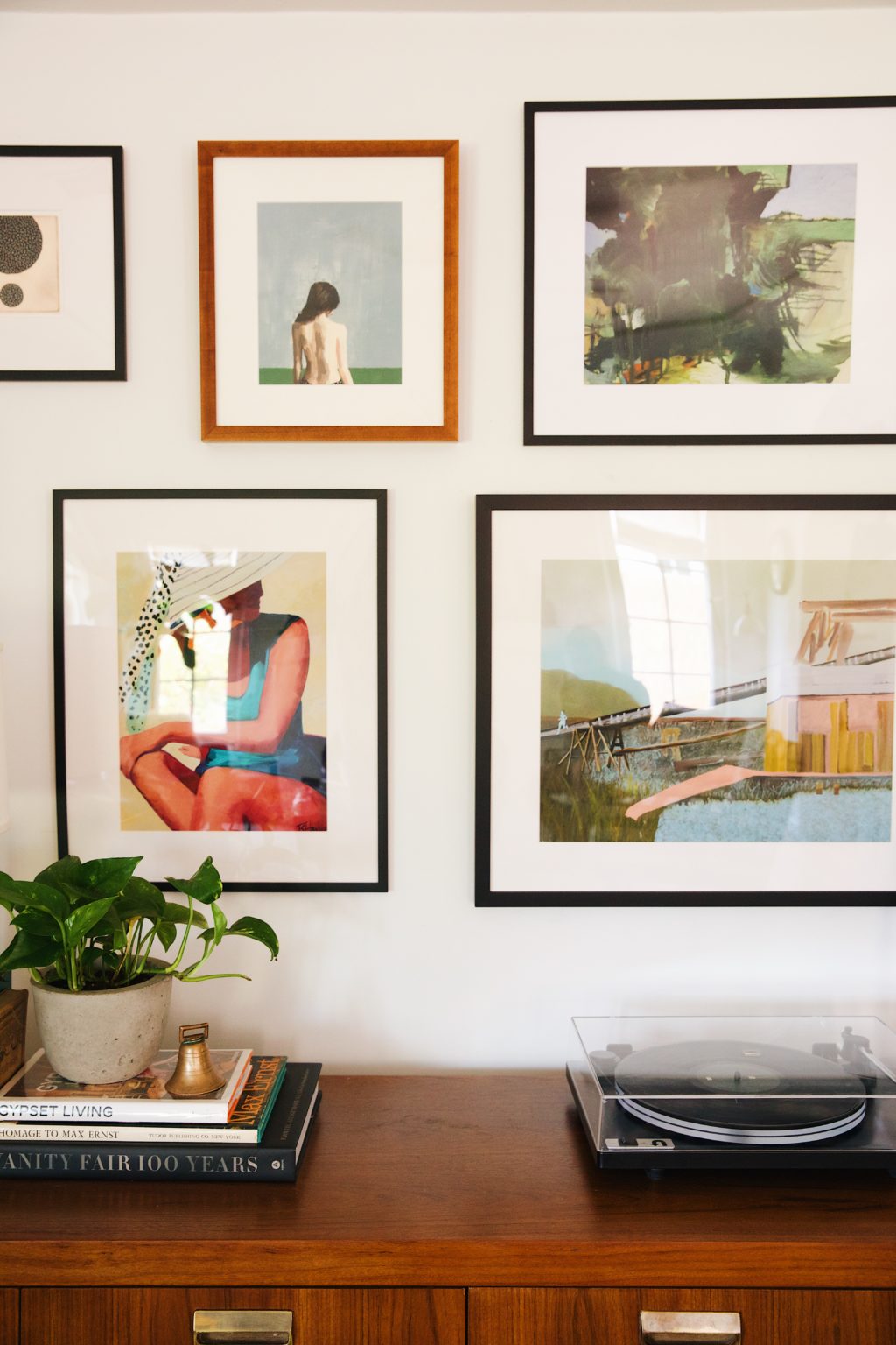

ARTWORK
After brining in the larger credenza we filtered out a ton of artwork. Two simple prints side by side, one large painting, a mirror, the possibilities were endless. One night we were browsing for some prints online and came across Artfully Walls. They have an amazing gallery wall generator that helps you plan out a gallery wall to scale. We’ve always been intimidated by gallery walls, but having all the measurements and seeing it online before purchasing was super helpful. We used blue painters tape to “map out” where each piece would live on the wall before moving forward and lived with that for about a week to make sure we liked it. We added in a few favorite art pieces that we’ve had for a while as well, and it really helped balance the space to make that large wall feel complete and intentional.
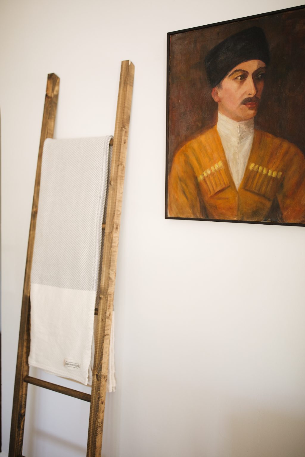
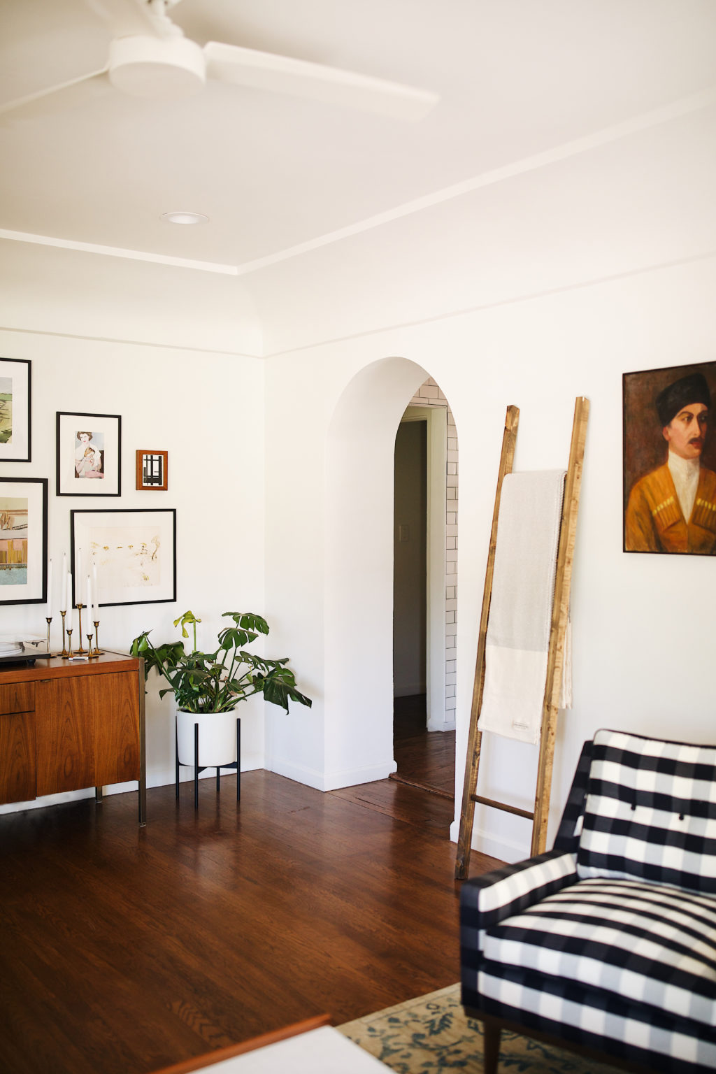
For that awkward wall in between the two archways we busted out our old blanket ladder from UO (similar here), and hung one of our favorite pieces of vintage art. Both are slim and allow people to easily pass behind the chairs. This little area really marries both sides of the room.
MAT/RUG
We played around with the idea of a runner, but a simple mat worked nicely here especially as we went a little bolder with our living room rug and the two are very close in proximity. We didn’t want anything too pattern heavy, so this jute one from World Market was a simple addition. Having the living room rug off to one side of the room and a separate mat by the door really helped define each space as their own.
Now that its all said and done, it looks super simple but it sure was a process. We’re happy we were able to find the balance of functionality and personality while incorporating some of our vintage pieces and artwork. Do any of you guys have an entryway that opens right into your living room or dining room? What are your entryway essentials?
Shop the post:
Furniture & decor sources: white ceiling fan | vintage credenza (similar here) | Rejuvenation lamp | Schoolhouse planters (similar here and here) and hooks (similar) | U-Turn Audio turn table | World Market Windsor chair and mat | Gallery wall art via Artfully Walls: Sunny Beach Day, Mother and Child, Yellow Climb, Porous #57, Rebellion, Trees I, Desert Scene


We have an entryway that also opens right into our living room and it’s been one of the most challenging spaces for me to decorate. It’s hard to make them cute, but functional! Since we live in Minnesota, I have to plan for wet, snowy boats and bulky coats for several months of the year. We ended up buying a loveseat and using that to close off the two spaces and that’s made a huge difference. You did an excellent job balancing yours off!
A lovely entryway & the credenza was a fantastic find! The brass details really make it an extra special piece.
You have such a wonderful sense of eclectic style. I’m in Phoenix as well and saw you mentioned Modern Manor as one of your favorite antique stores and was wondering if you could share any more recommendations! I recently moved and am struggling to find the key pieces I need to complete my home. Let me know!
Thank you!
What a lovely space! Would you share the source for your umbrella stand? Thanks!
Just recently found your blog. Love your house!
We just bought a fixer in San Diego-built in 1951, it also has no defined entry-just open the door and voila you’re right in the living area…it’s going to be a challenge for sure.
Right now we are picking finishes/tile etc to replace the hideous 1980s “upgrade” that others who owned the home have done.
Lots of work ahead of us, and I am happy to have some good blog posts for inspiration 🙂 Thanks!
Hi Susan — Congrats on the new house! San Diego is one of our favorite places. I’m sure it’s a beaut! You must be so excited to get everything going. So glad you found our site. 🙂
Just stumbled on this post even via pinterest though I’ve been following your blog for awhile! We have a 1930s house in Napa, CA and same thing. Open the front door and boom – dining room/living room. We also have a big window all along the wall when you come in so we lose that space too! I’ve struggled to find the right way to store kid boots, backpacks, dog leashes etc etc etc. Luckily we don’t have too much inclement weather to plan for but it is still annoying! Your post has a lot of what I’m doing already so it was nice to be validated (haha) and get a couple new ideas!! Love this. Thank you!