image via
So it doesn’t feel like it was too long ago that we were sharing our bedroom reveal. It all sounds so crazy to be starting work on the house again…almost a year to the date, but I think after living with the house a bit we have learned what is a priority for us, what we love about the space and what we want to change. The bedroom was the room we did the least amount to…especially when shown on the blog for the first time. We changed out some lighting, had some shades made to fit our funky sized windows, and dressed up the space with some fresh bedding and artwork…pretty minimal. Since then we’ve removed the texture from the walls (so messy, but such a game changer!), switched out some bedding and so on…

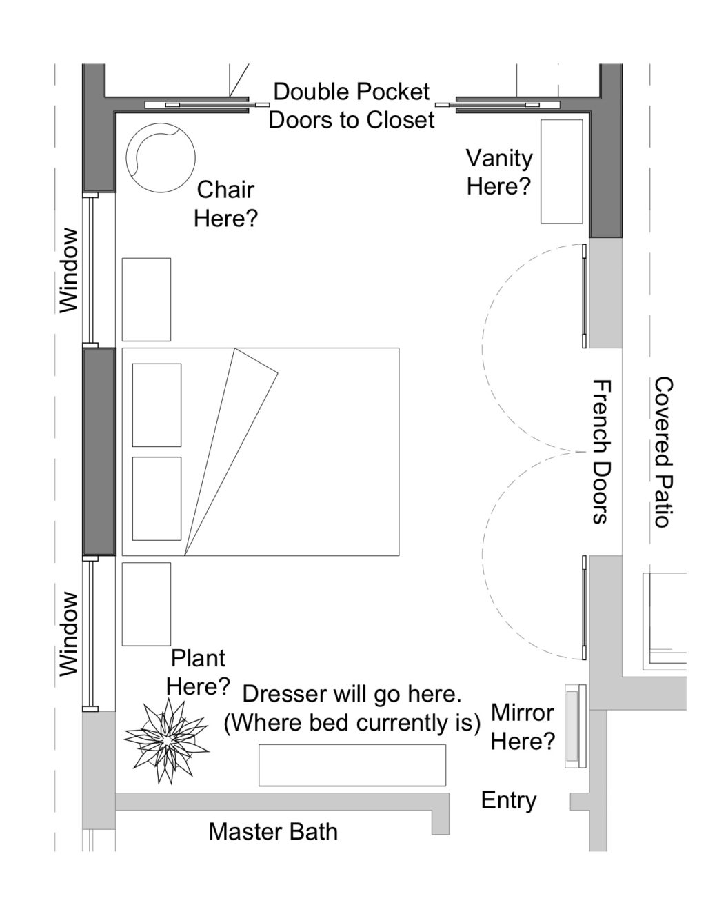
We’re looking forward to diving into this project over the next month or so. As mentioned in our previous post, we’ll be pushing the room out a few feet and building a master closet addition as well. We didn’t want a huge room (it would be kind of silly in comparison to the rest of the house), but we wanted it to be more practical. The bed is currently the left of the room when you walk in and pretty close to the wall, so I have just enough room between the bed and the wall to get our night table in. (You can kind of tell in this post.) We are going to reconfigure the room to have the headboard be on the left wall facing the windows (soon to be French doors) on the right wall… did I lose you already? The plan below will probably help.

(Plan above courtesy of Ron Elliott Studio — so excited to be working with such a great team in Phoenix!)
The windows on the right are going to be switched out for French doors to the yard and the left of the doors I plan to put a little vanity/getting ready area. Our dresser will go on the wall that is currently where our bed is situated. The room is in the back of the house and doesn’t get much light, so we’re excited about brightening up the space with decor, as well as moving windows, adding the doors and a skylight. We’re looking at some really fun doors for the closet and off the patio…maybe something like this or this? Or you can go mirrored…the possibilities are endless and kind of crazy. Ha! What do you guys think?
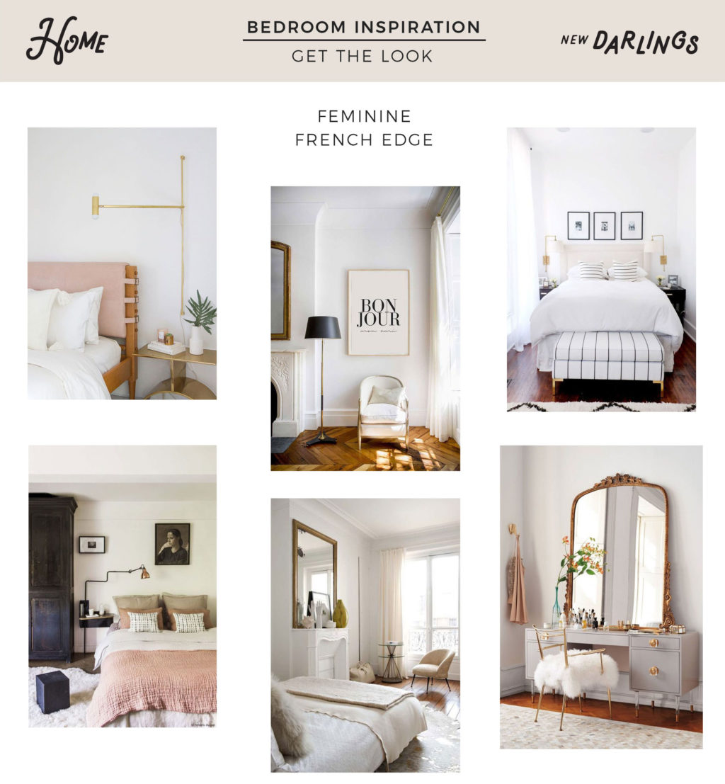
We’re really excited to see this all come to life and of course: decorate! We are looking forward to giving it a more feminine and soft feel with blush and mustard tones, creating a calming space to rest our heads each night. Take a peek at our inspiration below.

1 | 2 | 3 | 4 | 5 | 6 | 7 | 8 | 9 | 10 | 11 | 12
To see more of our home projects, click here.
Follow along with us on Pinterest for more home inspiration, too!


I love seeing this process! I can’t wait to see how it all comes together! We’re planning to put up more artwork and our photos in our house this weekend and I’m drawing some serious inspo from you!
Thanks so much! 🙂 Adding artwork is always so much fun…we go crazy with the placement of gallery walls and photos, but once its done it feels so good!
why don’t you connect your master bath to your bedroom with a door? Thank your for sharing your renovations
Thanks for the comment! We currently have a door that leads to a hallway with the master bathroom and bedroom, (if you’re in the hallway the entry to the bathroom is on the left and then you keep going and the entry to the bedroom is in front of you) so they’re connected by that hallway vs a door from the master bedroom. I feel like that can be hard to explain through typing vs actually showing you guys. It’s like it’s own separate area of the house. We’ll have to do a video of the process and when its all complete. 🙂
I was wondering if you could tell me if the black and white chair you have from School House Electric is comfortable for everyday sitting. It would be in a true family room that we sit and watch TV in daily?
Any pros and cons would be greatly appreciated.
Love your style and reading your blog.
Christy
Hi Christy, thanks so much for the kind words. We love the Schoolhouse Chairs..they are super plush and comfy. They don’t have a super high back though – that might be something to take into consideration depending on your favorite tv watching position. 😉 The black part of the plaid pattern can show stains easily, like for example…our pup’s nose runs a lot, so there’s a bit of that to clean up, but a damp cloth did the trick. Other than that, we love them. We moved around some furniture in the living room, but are still holding onto those – I think they’re a really fun pattern and something you don’t see often. Hope that helps! Good luck with the family room redesign! 🙂
Dear Robert and Christina,
I love everything you post and you truly inspire me. It is the first time I comment on any blog. I have been following you (from Spain ????) and I have noticed that you have changed your living room and dining room. I like it so much so I was wondering if you could post about it. Thank you for everything you share.
Fatima