 image via
Last month we started talking about plans for the guesthouse. Layout, timeline, all the important stuff. After getting some of the major stuff out of the way like, deciding to raise the floor to meet the driveway elevation (to prevent any potential flooding after a big rain), removing the garage door to create a large open window, removing ceiling beams and raising the roof a few feet to compensate for the floor being raised, and AC unit, we’re now beginning to think about the fun part: decor and color scheme.
So we obviously have a ways to go with this, but we love to plan ahead so that there aren’t any hiccups later on. When we talk about decor, we’re not talking about furniture choices. We’re talking about the very first phase that comes even before that i.e. what type of light fixtures will be using so we know where all the electrical should be placed (mounted or not mounted, how many, etc), appliances (refrigerator size, range, sink, etc), bathroom vanity and tile choices, flooring…all that jazz!
 photo via
 photo via
Let’s start with flooring. We think the most cost effective and “safe” choice for this space will be to grind down and finish the concrete floors. A friend of ours had it done throughout her entire home and it looks super sleek and clean, perfect for layering area rugs, etc. The major reason why we’re so for it, aside from style, is for practicality. If (and I’m hoping that is a bigggg if!) we get water in there from a rain storm, it would be an easy (or easier) clean up than hardwood, laminate, carpet etc.), so we’re really excited about that.

image via
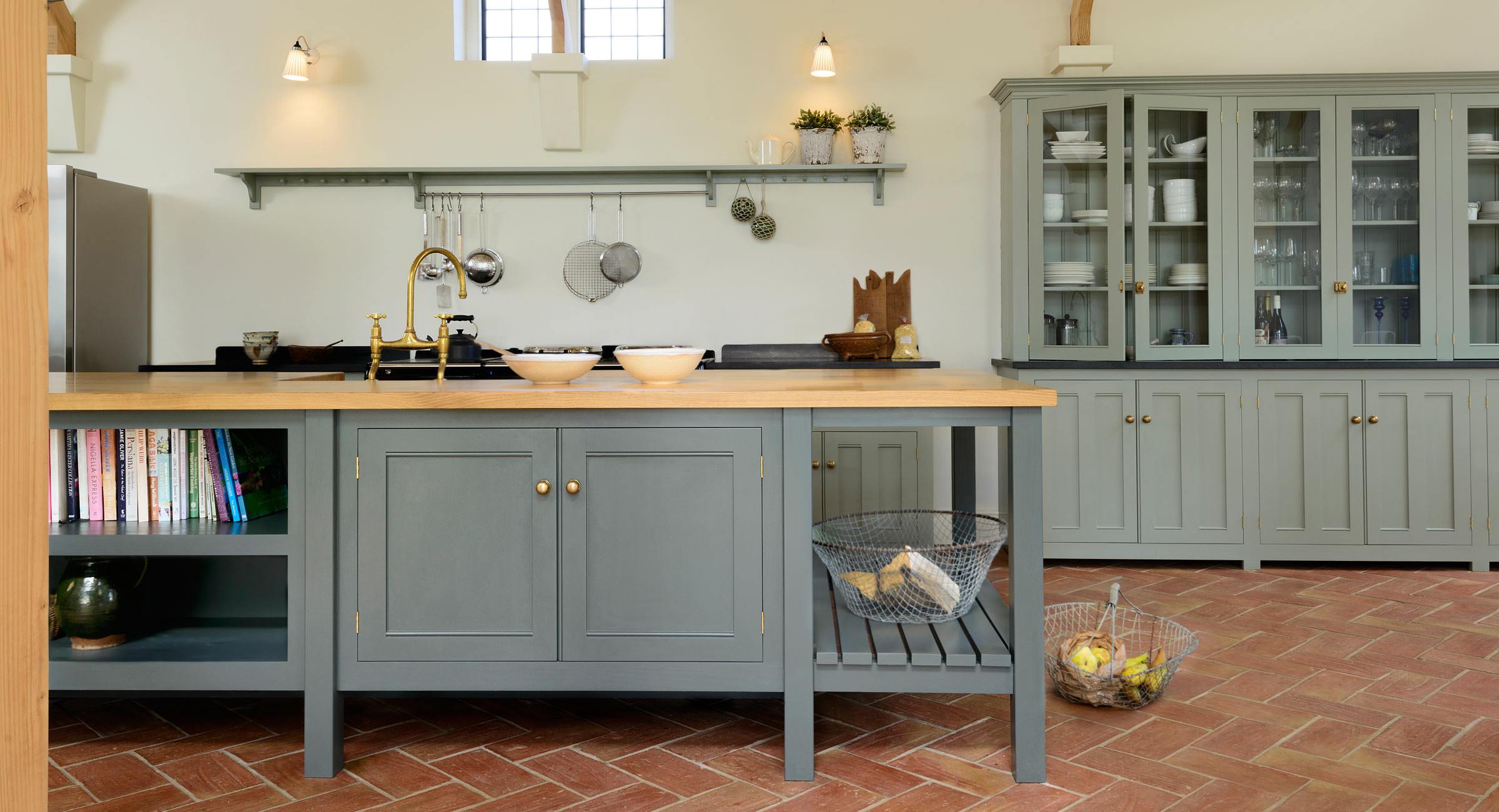
Next, we’re thinking about adding color into this space in a big way giving the kitchen cabinets a bold hue. For the kitchen in our home we went with white cabinets and we’re still super happy with the neutral choice. It’s a bright, fresh and happy space, but we thought we could go with a color in the guesthouse as we were less likely to get bored with it, seeing as we’re technically not looking at every day. We’re currently leaning toward an emerald green or deep navy for the cabinets. The image above is from deVOL and they have the most stunning kitchens. We literally spent hours drooling over their designs. Here are a few others that are giving us a major inspiration.

 The little kitchen will be studio apartment style, running across one side of the house, where we will have a full size fridge and sink. We are still deciding on whether to put a full range in the casita or go for an induction burner. Even though the plan is for this to be my sister’s temporary home for a few months as she makes the move and acclimates to AZ, the majority of the time it will serve as a place for out of town family and friends to stay for a week or so when visiting, and maybe (big maybe) down the line we’ll rent it out as an airbnb.
 image via
For the bathroom we’re looking at a 24″ standard vanity with storage, continuing the concrete flooring in there as well, and small black matte hex in the shower. We’re also loving the idea of a concrete sink, similar to the image below. Any thoughts?
 image via
Well that’s about where we’re at for now. Still deciding on what color hardware. It’s between brass and silver currently. I think we’ll keep it the same throughout the space, given the small size, to keep an even flow.
Any suggestions, ideas or comments? We’ll be moving the rest of what’s in the garage to the shed this week. We can’t wait to see this take shape!
To see the initial guesthouse plan and some before photos, view the post here.
For more guesthouse & casita inspiration, follow along with us on Pinterest here.


If you’re thinking of going with a bold cabinet color in here, you HAVE to check out Jenny’s new studio kitchen over on littlegreennotebook.com – she chose a deep forest green color and it looks so good!!