
Yay! The backyard is done! Well, one third of it anyway. Hah! Over the last several months we have been working with the amazing designers over at Havenly on our backyard design and we can’t wait to lounge back there with some music playing and drinks in hand.
Keep reading to see more of the space…
So, where to begin? Flooring! We mentioned in a previous post about our plan for the space beginning with changing the flooring. We ripped up the saltillo tile and added pavers. The pavers we went with are called Arizona pavers, but are pretty common no matter where you live. They necessarily wouldn’t have been our first choice, but the front of our house, driveway, and other patio area in the back had this style tile, so we decided to keep it all uniform. In the end we think it is a great neutral base for any design aesthetic and will work well even if we decide to mix up the color palette down the line.
 As you might have seen from our inspiration photos, or pins, we really wanted a neutral color palette. Something calming and almost cottage feeling. We have a rather green backyard and we wanted to embrace that, staying away from southwestern prints and bright colors, that are usually associated with the desert landscape. We had all these ideas and pieces we wanted to incorporate but we were a little unsure of the layout, especially considering there are two other patio spaces in our yard. We weren’t sure how to make the most sense out of the yard, what should go where, and that’s where Kylee, our designer from Havenly swooped in!
For anyone who isn’t familiar with Havenly they are an online design service that walks you through designing any space in (or outside) of your home step by step. Our designer was Kylee and she was amazing with nailing down our style while staying within the budget we had in mind, and finding a spot for everything we wanted to include. The process began with a questionnaire, discussing everything from styles of furniture and patterns we like to what we enjoy doing in our spare time and what a dream vacation would be. Next comes compiling a few Pinterest inspiration images you may be loving and then the fun part…
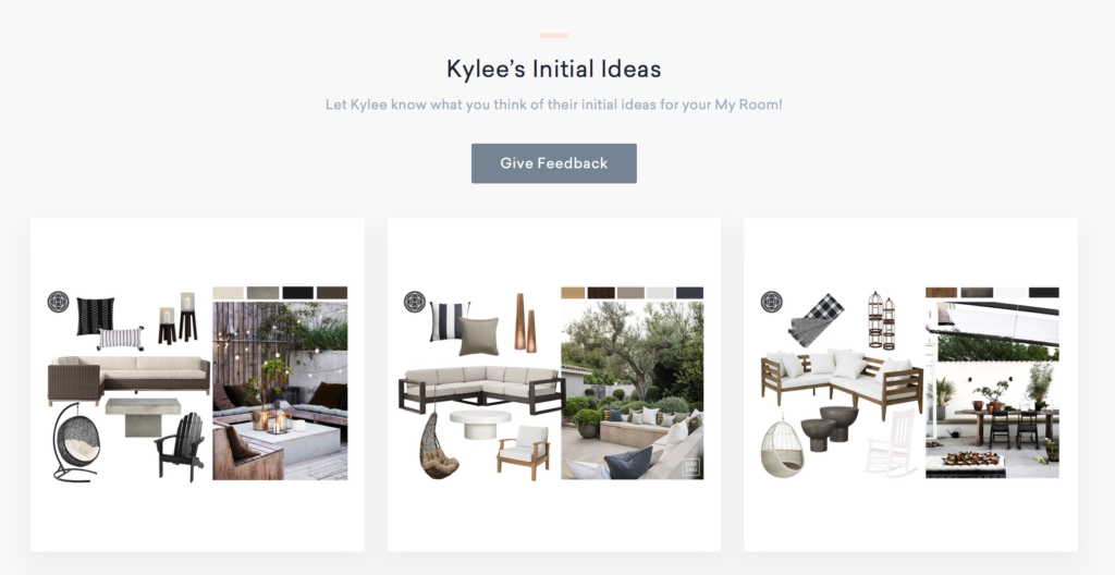
These were the three looks Kylee put together for us based off of our Pinterest images. From here you can add in comments for each board, note what items you like and which ones you don’t, overall feel, etc. We picked option three, with a few tweaks.

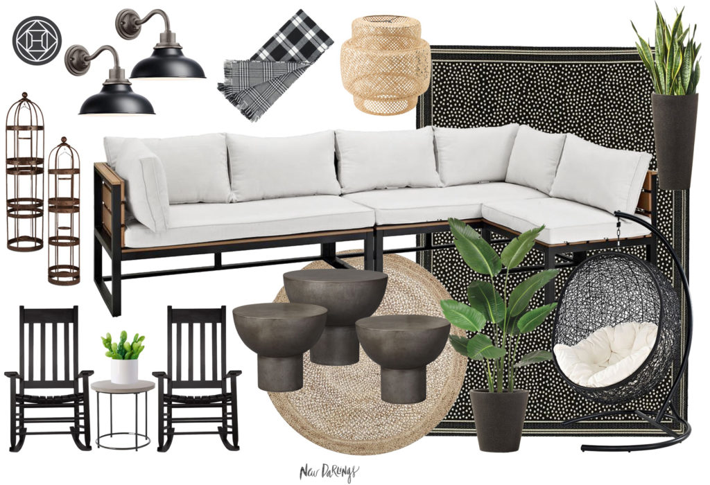
Above was what our final design concept looked like. This part was a lot of fun for us. In the past, when we found one piece of furniture we liked, we would to stick to the same retailer for the rest of the items for the space due to convenience. Kylee was able to find items from all different shops and mix the textures we had in mind. We went through 2-3 concept revisions switching out planters, lanterns, side tables, etc. We couldn’t wait for everything to arrive, especially that swing!
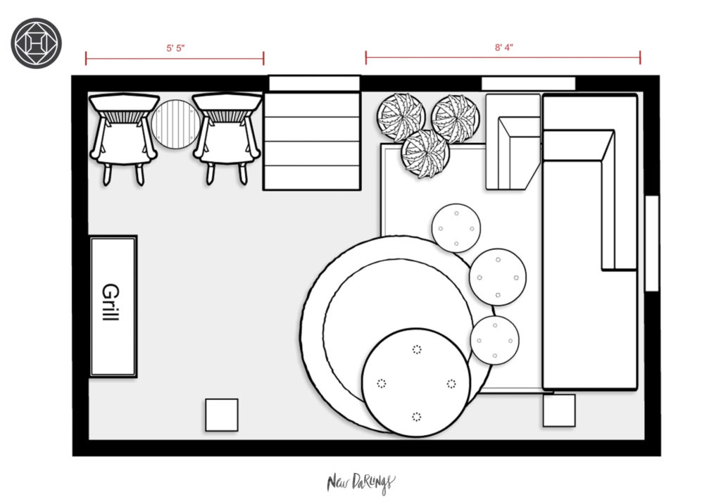
A peek at the floorplan above…
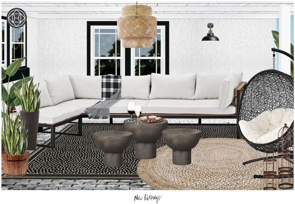
swing | route jute rug | outdoor seating | side tables | planters | rocking chairs | white side table | sconces
…and a 3-D rendering of how the furniture would look in the space. This is super helpful, especially if you start with different fixtures, paint colors, and flooring like we did.
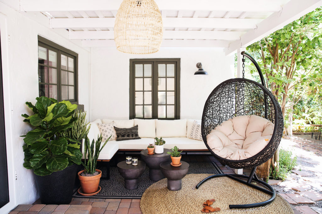
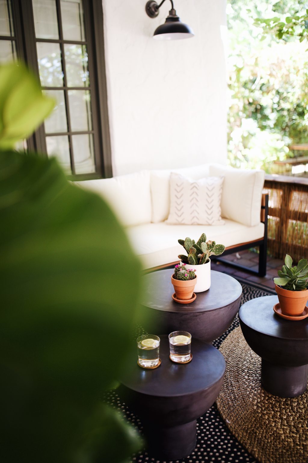
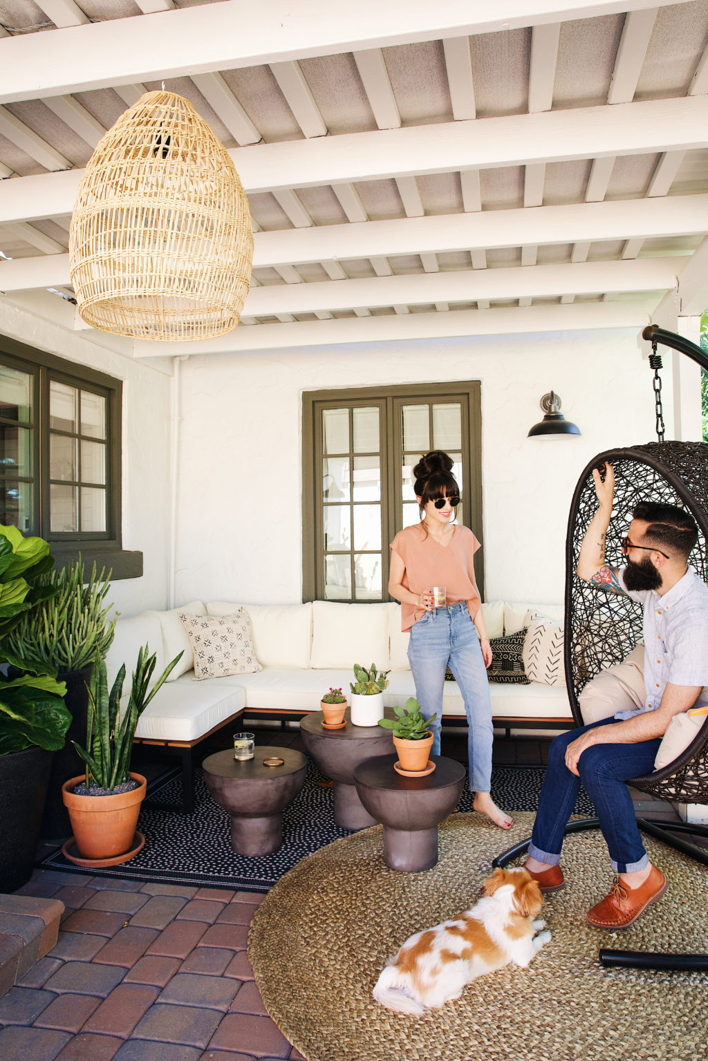
Love the layered rugs in this space! We knew we wanted a pattern, but nothing too bold or loud. This little polka dot one with the round jute set the perfect tone for the space and really anchored the furniture pieces. We brought in an outdoor sofa that fit the space perfectly. If you’re looking into this outdoor seating, it also comes with a coffee table. Bonus! We didn’t use it in the area, and have some other plans for it in the yard, but it would make a nice addition as well. So wicker, jute, and wood were the textures we were playing around with, and we didn’t hesitate with bringing in a fourth one: concrete! The coffee tables are actually side tables from CB2 that we clustered in the lounge area in varying heights. We love how all the textures play off each other and everything feels comfortable and not over-styled.
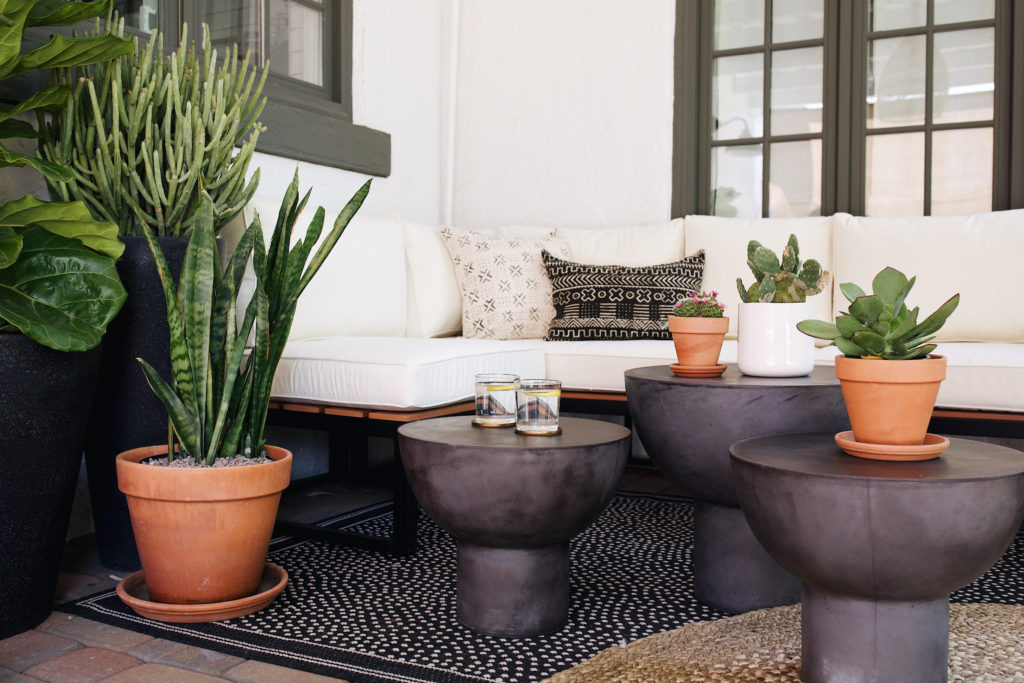
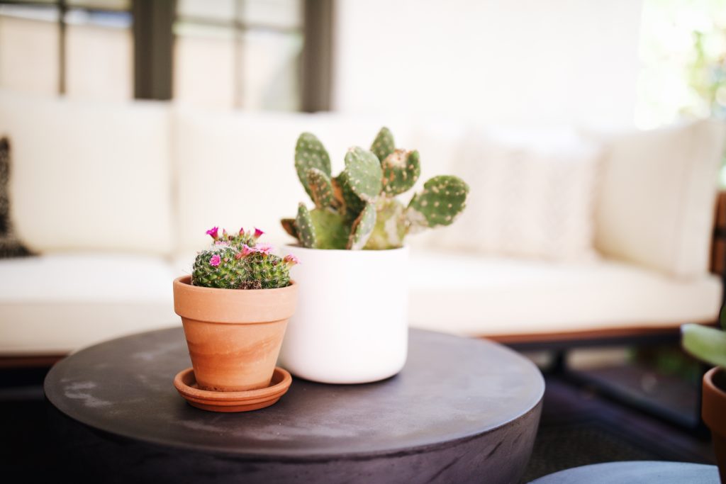
As the furniture began to trickle in we began thinking about what type of plants we wanted back there. We brought home our third fiddle leaf from Camelback Flowershop after having such great luck with the beauties she carries there, and some fun cactus. Not going to lie, when we first unboxed the planters, we thought we had made a mistake. They looked huge! But they fill the space quite nicely and really were the icing on the cake. Also, not sure if any of you have kept a fiddle leaf fig outside before. We were a bit nervous, but so far so good. We’ve just been watering it several times a week and keep it in shade, vs our indoor ones which are by the windows in our home and get watered only once a week.
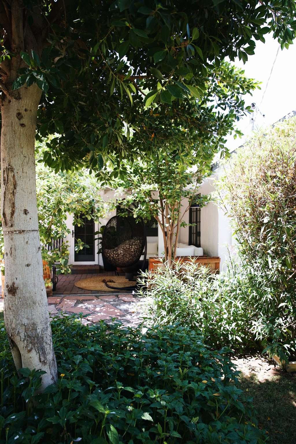
We added a large agave to the corner next to our apple tree! This yard of ours wows us everyday. There’s some fig trees and pomegranate trees as well. We’re looking into adding a lemon and orange tree down the line.
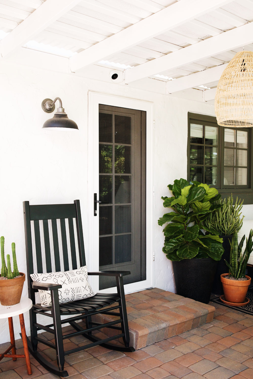
We added two rocking chairs from Rejuvenation (they are now sold out, but there are similar ones here) and a little side table from World Market to the right of when you step outside. There’s something so charming about a set of rocking chairs. We’ve sat outside in the evening chatting about our day a few times since we’ve had this area put together, and its so calming. I can’t help but get a little sentimental and hope we’ll be rocking away in these chairs when we grow old and gray. Too much? Okay sorry, but it’s true! Back to the design…
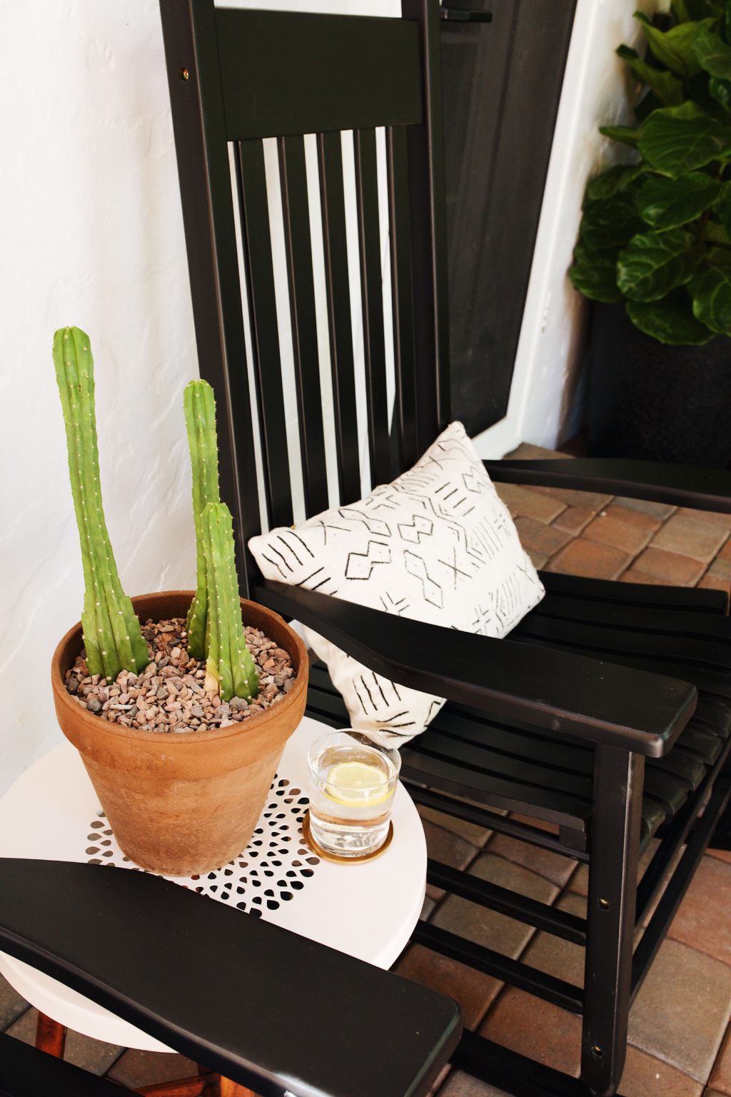
The side table is a little different than the original rendering. The original concrete one sold out before we had a chance to place the order, so Kylee was super helpful with offering some other options. She knew we wanted to add some warmth to the space, so the white metal with wooden legs were perfect.
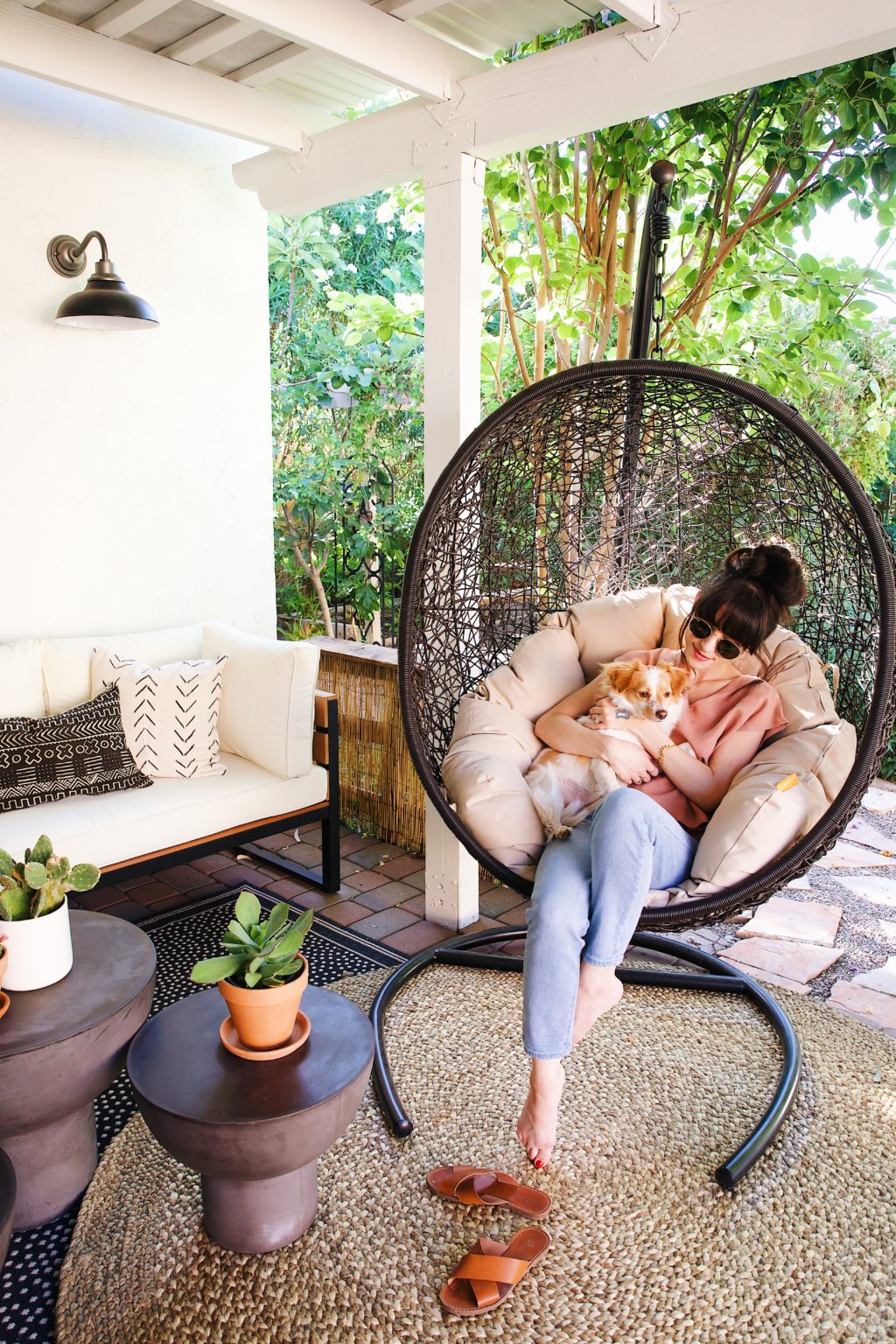
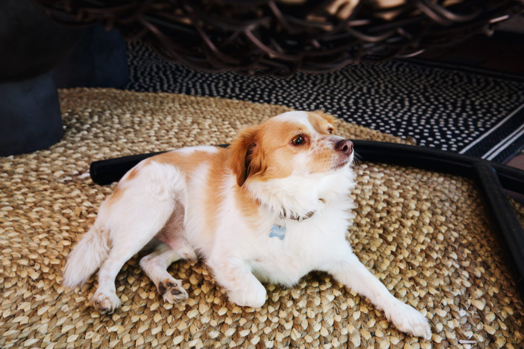
One of our favorite parts of this space has to be the swing and we think Henry would agree! Haha. Seriously, when we go outside, he just sits by it waiting to be picked up. He’ll snooze and sway on there for hours, as will we! We really didn’t have too many requests or must-haves for this space. We really just wanted something comfortable and practical. The swing felt like a bonus. We always saw them in trendy restaurant lounges or beach restaurants and when we found room for one in the design, we were super excited. Anyone else get this excited about furniture and room designs? 😉 Between the sofa, swinging egg chair, and the two rocking chairs, we have created a pretty comfortable conversation space for when friends and family are over, and that was our main goal.
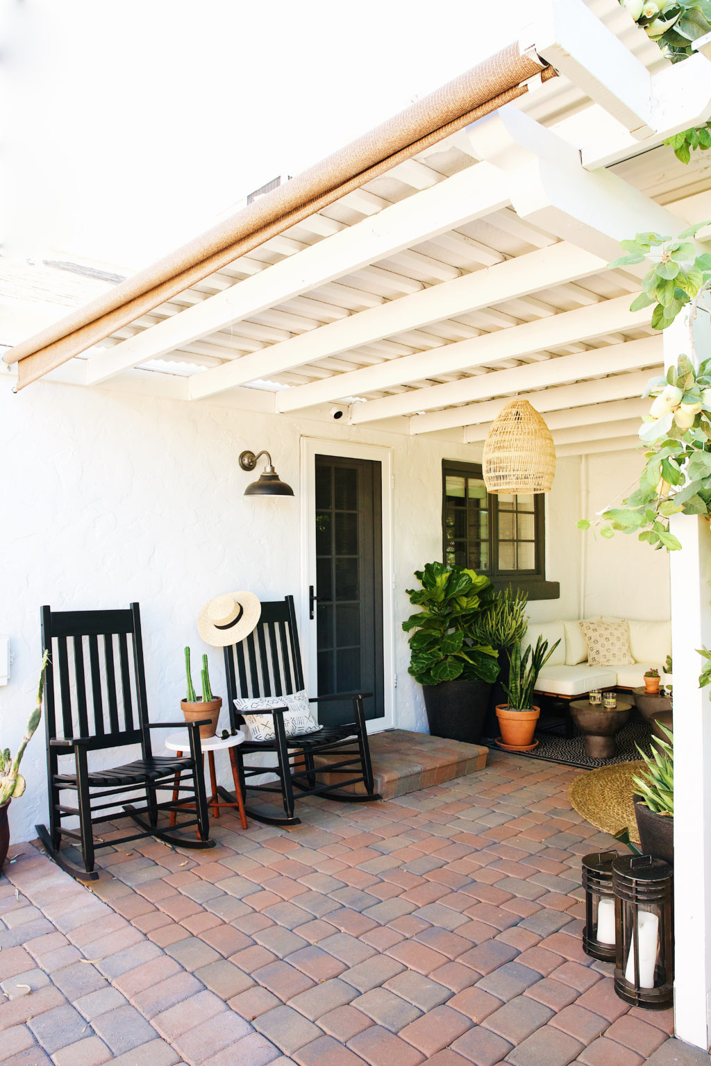
In the center of everything is this fun straw pendant light from World Market (gotta love that place, it always feels like they have everything and anything). We originally were going with an IKEA one, but it felt a little too large for the space. This one is a bit smaller all around which is a better fit and still makes a statement without looking overwhelming.

Speaking of lights, we switched out the old scones with these matte black ones from Rejuvenation. Once these popped up in the design we were pretty pumped, because we had already purchased one for our front yard. They have a classic look to them without being stuffy or boring, plus they come in a TON of colors!
To finish everything off we added some mud cloth pillows from etsy. (You might remember them from our old living room.)
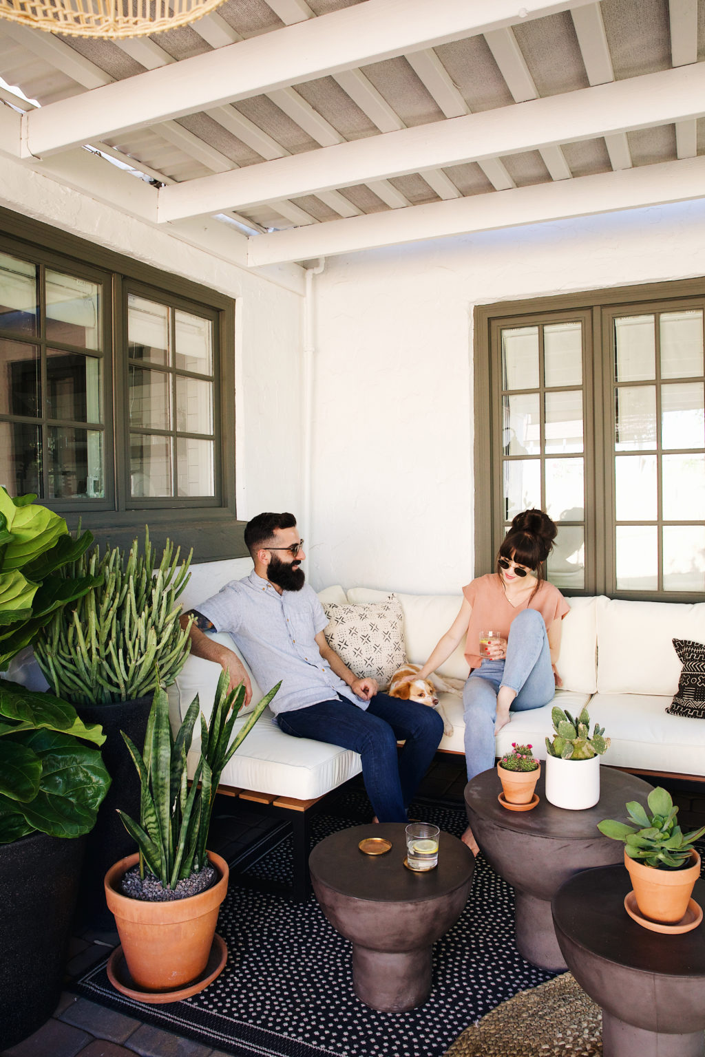
We’re looking forward to stringing some lights throughout the yard and getting the rest of the area together. We’re also planning on a dining area and then a mini lounge toward the back of the garage. We’ll see…for now we are just extremely happy to have this little nook. It has been so nice to have breakfast out there early in the morning and then hang out in the evenings while Henry gets out all of his energy before bed. By getting out all of his energy, I mean running crazy amounts of laps around the yard like a roadrunner. Ha!
Hope you guys enjoy the space. It’s been so fun to share all these home remodels on the blog, and every step of the way. Keep an eye out for more backyard projects and if you have any questions, leave them in the comments below! 🙂
If you’d like to try out Havenly, they have so generously offered 25% off a full room design, with code: NEWDARLINGSNEWROOM. Happy decorating!
Shop the post:
See the backyard inspiration post here.
See more of our home remodel here.
This post was made in partnership with Havenly. As always all thoughts & opinions are our own.


SO perfect, guys! This is giving me tons of inspiration for my one day backyard 🙂
Where is the black and white polka dot rug from?
Wondering the same thing–have you found it? 🙂
Just Gorgeous! I have been considering giving the pinterest mood board idea a try! I’m sure you were able to get tons of inspiration from it! Hoping to re-create something similar for my little apartment patio! <3
This looks amazing guys, thanks for all the references. I want the bench but it’s on backorder until August – but that might be OK considering it’s so hot in Phoenix right now I can wait until our perfect outdoor weather hits this fall 🙂
Thanks so much Diana! That’s true. We can’t wait for the cooler weather either.
Where did you guys find your black & white polka dot rug?
ditto to all the questions about the black and white rug, it’s perfect!
Thank you for sharing this. You gave me an idea on what my backyard should look like. I really love it.
It looks amazing. Was deciding on what design company online service to use and your gorgeous patio sold me on Havenly for several of my rooms that just need a little tLc (refresh). Looked at a few others however the before and after photos just were eh. I know everyone these days are professional designers lol, but in full disclosure I can definitely appreciate a beautiful space that is comfortable and also chic. Thank you for sharing. You and your puppy are adorable.