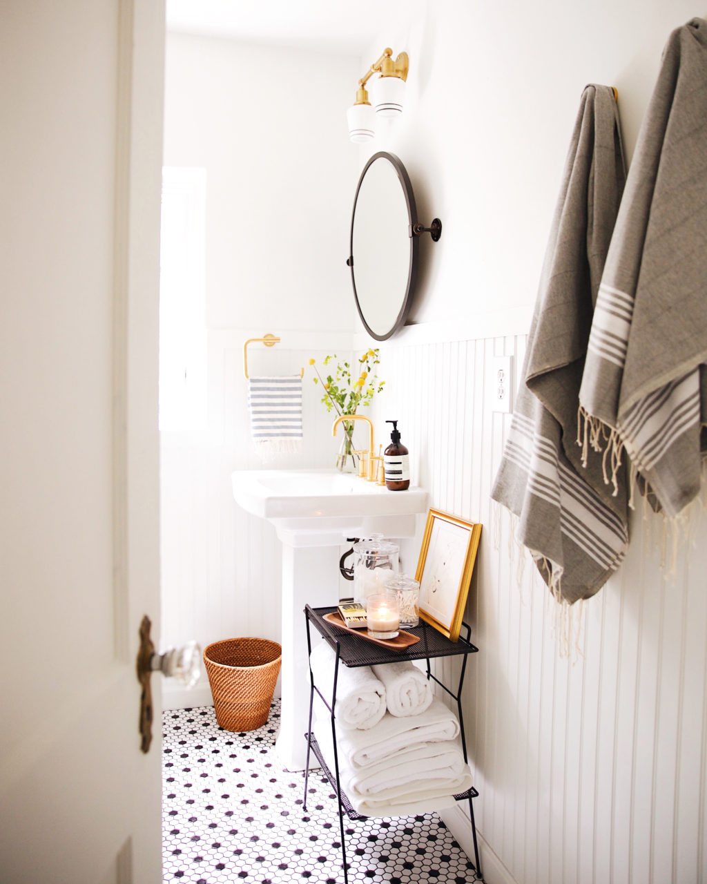
Today we are sharing our guest/hallway bathroom makeover. We didn’t share a before or progress post on this space, but you may have caught a peek or two on IG stories. This little bathroom is a charmer and we were so happy to partner with Wayfair to freshen it up a bit. Our style direction for this room was vintage with a modern twist.
BEFORE

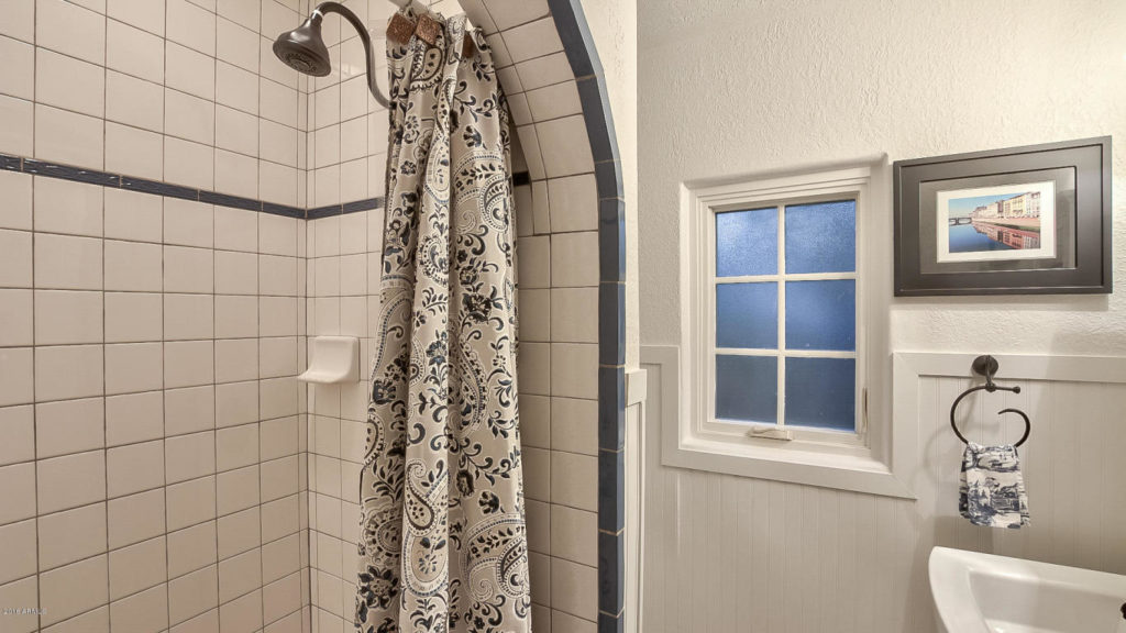
Before we dive into all the details, here’s a look at the bathroom from the listing and one from when we got the keys. It was super cute, but we weren’t feeling the blue accents or ornate shower head.
AFTER
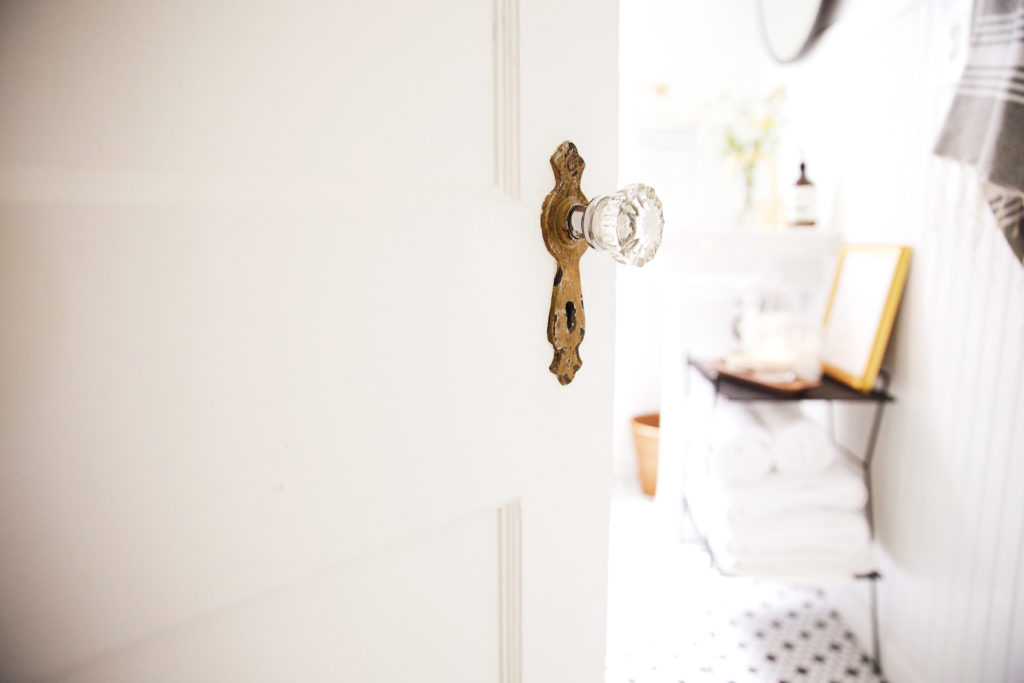
We didn’t want to strip the house of it’s charm or character, which can so easily happen when remodeling, so we wanted to choose finishes that were fresh and modern but still had a timeless air to them. Little details like these original door knobs are so special.
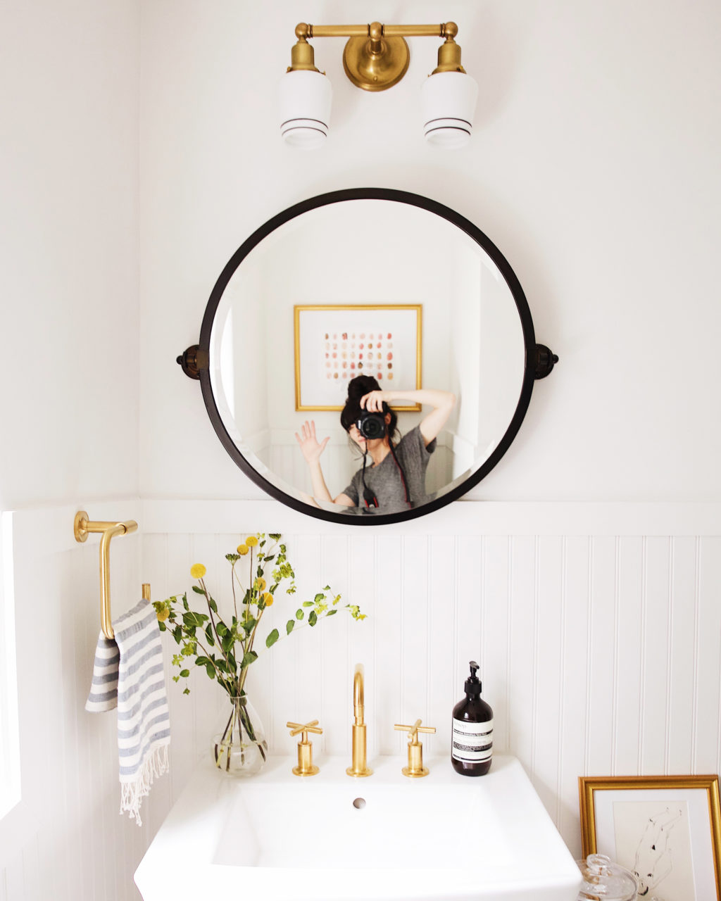
This remodel was kind of an “add-on” to our original plans for the house. It wasn’t a room that was really a priority for us to tackle. After thinking about it a bit we thought we could do a few updates that would make the bathroom flow with the rest of the house and our style better. To keep costs down, we decided to update the existing pedestal sink with some brass hardware. We fell in love with Kohler’s Purist line in Brushed Gold. The criss cross knobs feel like the perfect match with the pedestal sink, really giving it a vintage feel.
The existing mirror/medicine cabinet was really fun and farmhouse feeling, but it was a little on the small side and raised pretty high up. We wanted to keep the bead board, which adds some texture and a rustic element, but that made choosing a mirror a little tricky, so a pivoting mirror was the answer.
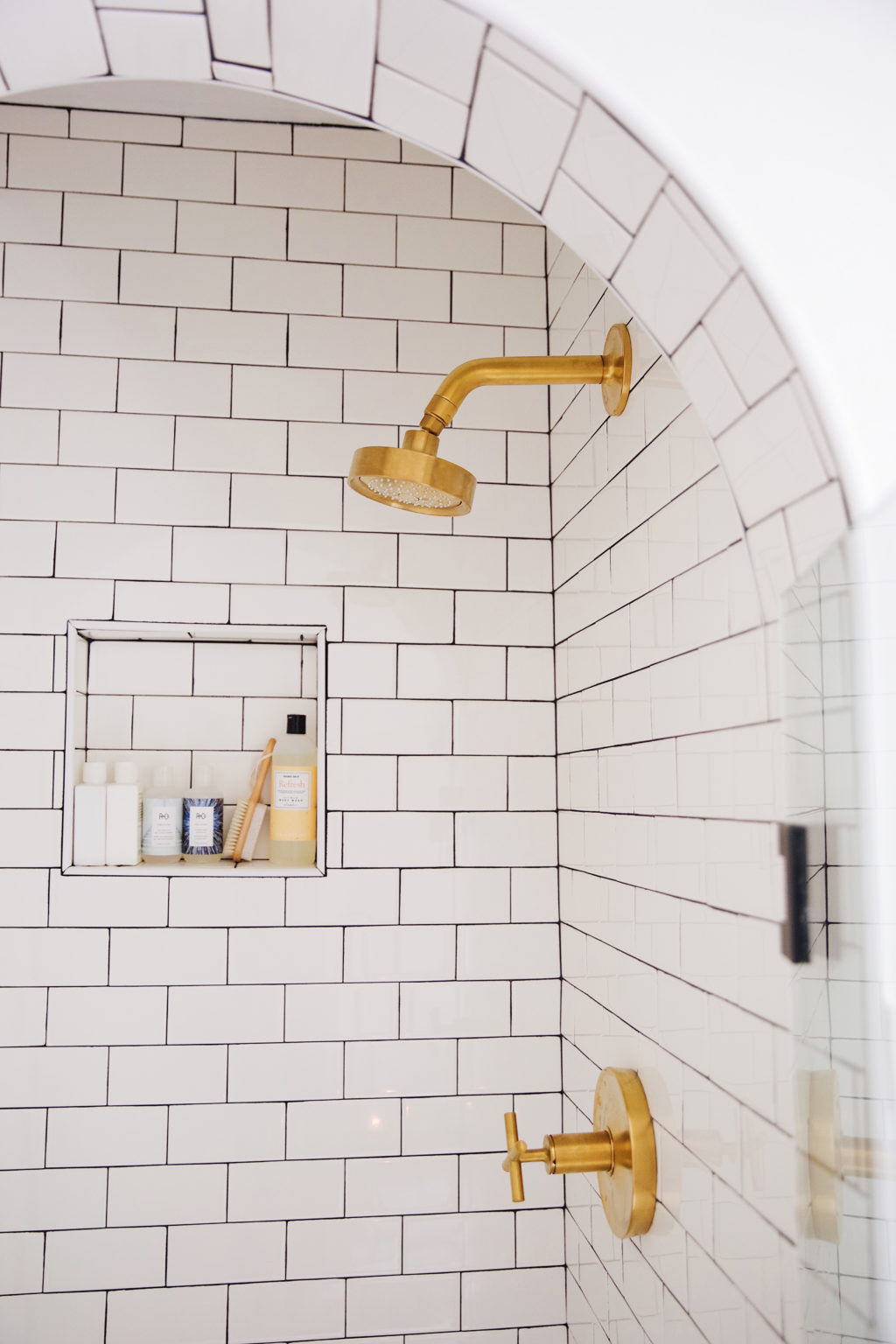 For flooring we kept it classic with a black and white hex tile and continued it in the shower. It has been super easy to clean and we really like how the brushed gold shower head and drain look against the black and white tile. The shower had a fun archway, mimicking many of the doorways throughout our home, which we definitely wanted to keep. We just freshened it up with the same subway tile we used in the kitchen, a classic white with charcoal grout.
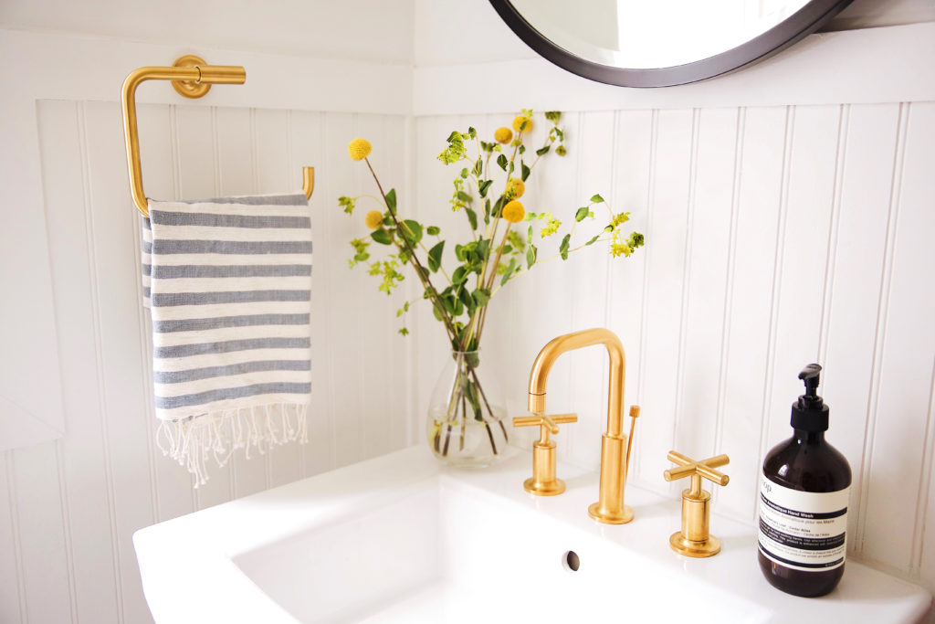
A matching towel ring, also from Kohler, that goes really well with the faucet.
These fixtures have been super easy to clean as well. I thought the gold would show water marks and finger prints a lot more than other finishes, but a quick wipe with some Mrs. Meyers all-purpose cleaner and they’re good to go!
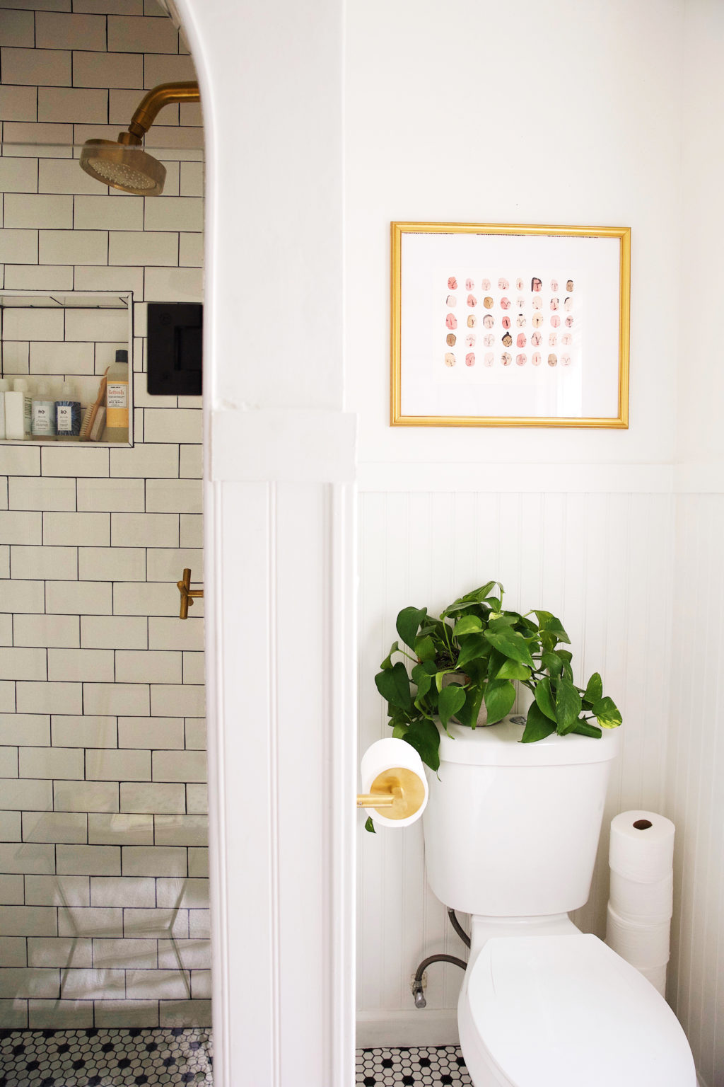
Opposite the sink is the toilet area. We dressed it up with a little plant and a favorite art piece by English artist, Faye Moorhouse.
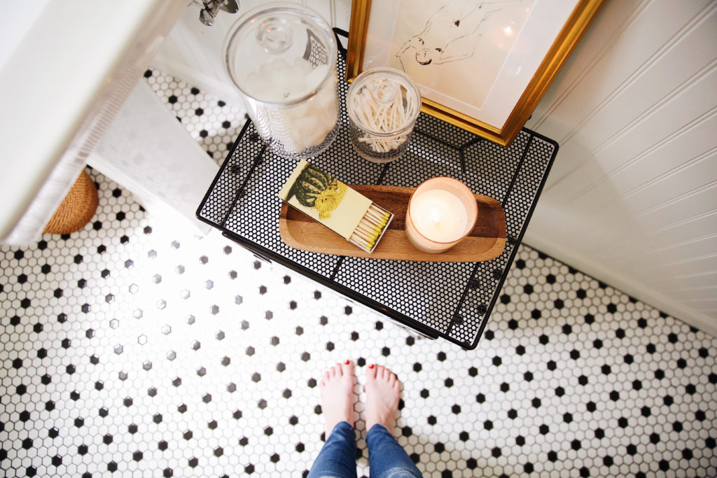
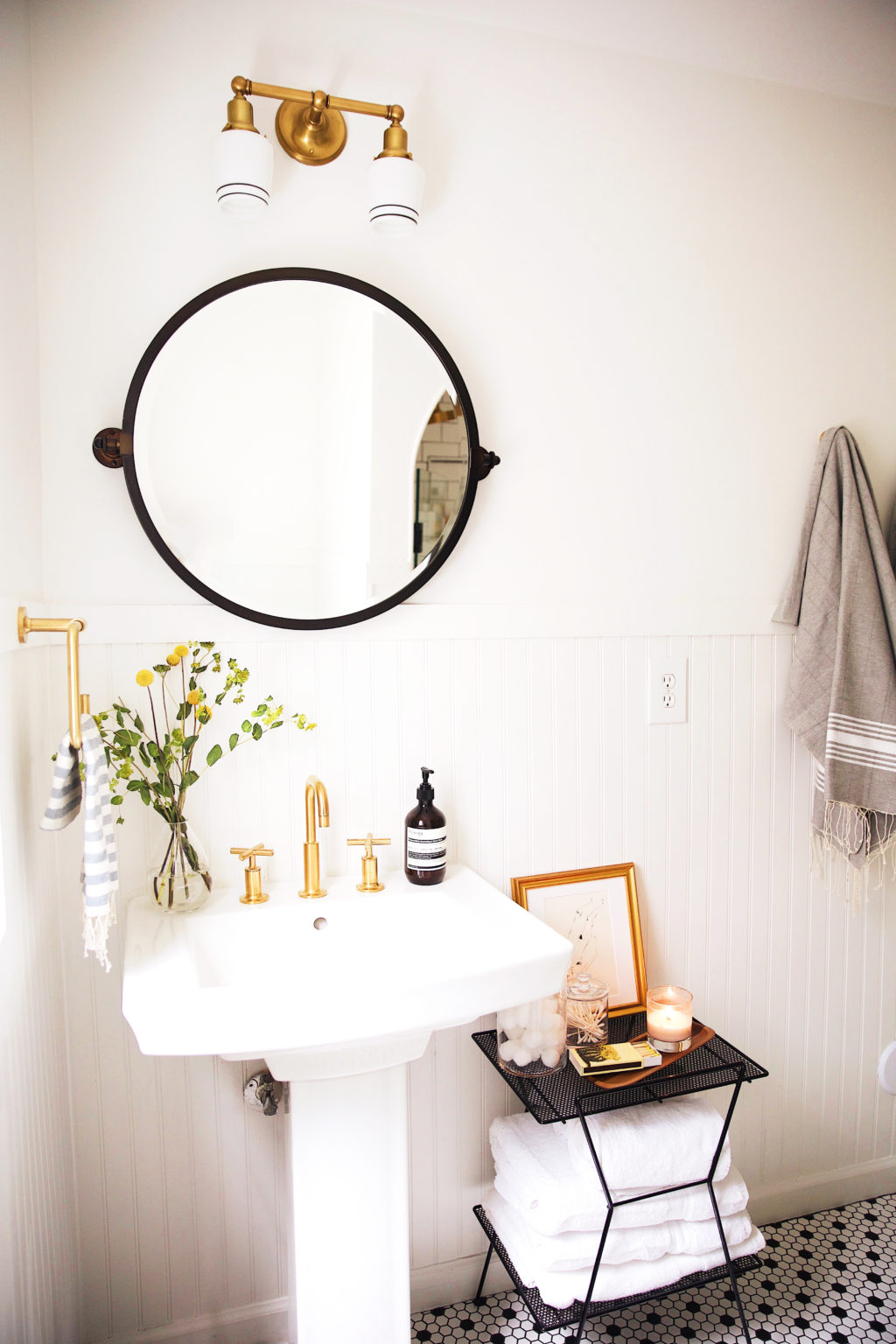
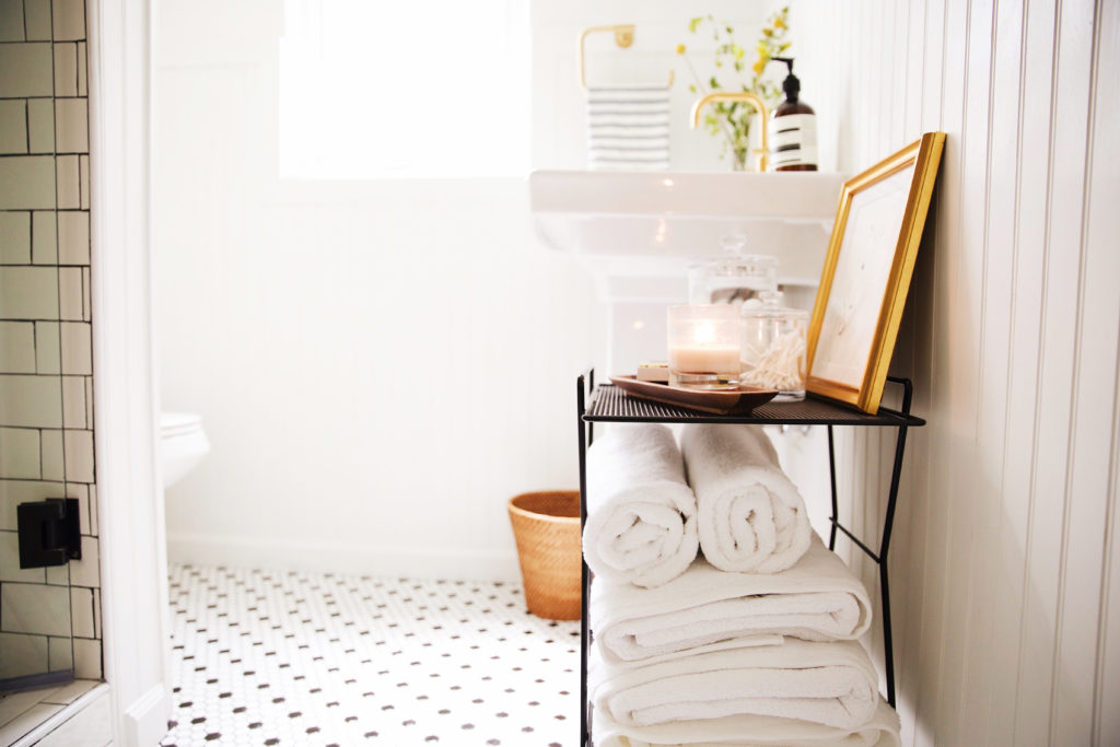
The bathroom is pretty narrow, but we didn’t want to reconfigure the space. Honestly, even if that was an option, I’m not too sure how we would have arranged everything. When you first walk in the bathroom there is a bunch of empty space, but not enough to put a little shelving unit which is what feels like belongs there. We went through a few options and then decided on a little side table to hold all our linens and toiletries for guests.
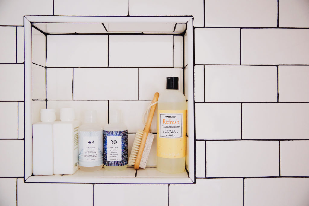
A little shower niche for keeping this area clutter free!
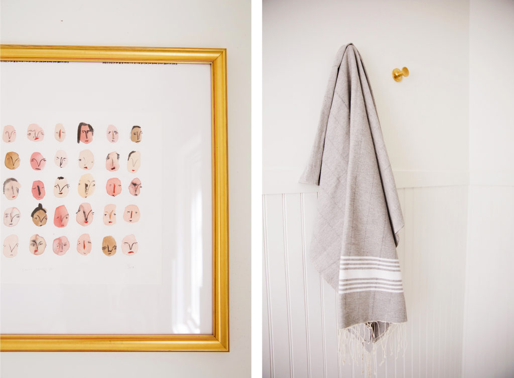
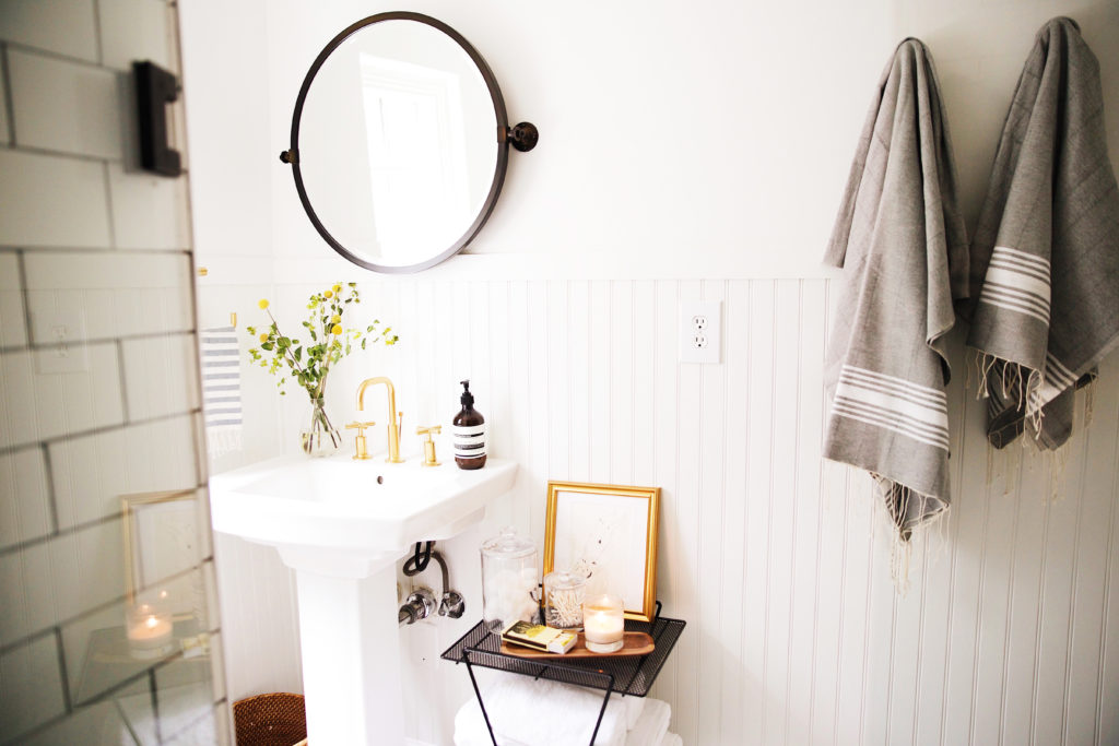
We opted for towel hooks instead of a towel bar in this space, right next to the side table. These Turkish towels add some pattern to the room (they also come in red and black), and are super soft! We really wanted a shower door vs a shower curtain in this room, and our contractor made it happen with a frameless pivot shower door. It really opens up the space and looks more finished.
It’s really been a dream to see this little house of ours come together. One room at a time it is feeling more and more like home. Wayfair’s Home Improvement section really allowed us to complete this space a lot faster than we anticipated with many of their quick-ship items. Much of the demo and remodel of this bathroom was done while we were away, and leaving town right before a big project was equally as exciting as it was stressful, with the anticipation and not knowing how things would be going. We really wanted to make sure all items were here at the house and labeled for our contractor before leaving. Having the peace of mind that everything was there and neatly organized, along with some visuals for the team to install was super helpful. Below is a look at a similar image we put together for our contractor, along with some links if you guys are interested. 🙂
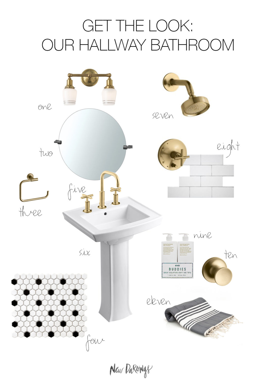
1 | 2 | 3 | 4 | 5 | 6 | 7 | 8 | 9 | 10 | 11
Also if you’re engaged, don’t forget to check out Wayfair’s Registry, to help you create your dream bathroom!
To see more of our home posts, head over to the OUR HOME tab on the navigation bar. We’ll be adding all of our home plans, inspiration boards, and room reveals there! 🙂


Thanks so much for sharing your amazing bathroom. It may be little in space but it’s big in style! I love everything! Thanks for the inspiration ?
Thanks Donna, that means a lot! We had fun finding ways to add a little more personality to the space. 🙂
Just lovely!I love the little pops of yellow gold, super stylish detailing!Gemma http://www.fadedwindmills.com
Love the remodel! Where’s your black side table from?
Thanks Marny. It’s from Schoolhouse Electric. We originally bought it for another room in the house, but it just felt like it belonged in there. 🙂
Just found myself BACK on this post!
Loving the little art pieces- where are these guys from?
Appreciate it 🙂
Thank you! Both art pieces are by English artist, Faye Moorhouse. Her work is so fun! 🙂
Oh my gosh it’s perfect, and I love all of the gold accents!
-Lauren
http://www.chic-ethique.com/
This looks amazing. And absolutely love all of the character in that shower!
Thanks so much Josh! 🙂
Love this! The link to the mirror doesn’t show that it has the black edging that your’s does – is this the same mirror? Thanks!
Can you tell me the name of the exact mirror you have in the picture? (The one with a black frame)
Thanks!
I really love the way the brushed gold pops! My husband and I are thinking of adding gold, copper, or black hardware to our bathroom to enhance the subway tile. We shall see!
http://www.veiledfree.com
We were between the brass and black. You can’t go wrong either way. 🙂 Good luck with the remodel and thanks for following along, Ciara! 🙂
This is about as dreamy as it gets!
// http://lifeplusbe.com/
Love the faces artwork. Where is that from?
I love what you did with your bathroom – the details you have carefully chosen are just perfect. Thx for sharing!! I am bookmarking you?
Love the painting of faces – where is that from?
Gorgeous in every way! Did you choose charcoal grout for the flooring tiles as well? xx
Yes, we did! It blends in nicely and is easy to keep clean. 😉
So you bought the subway tile from Wayfair and then added grout to it?
Was is hard getting rid of the textured walls?
I would love to know what color you painted the walls & trim in the bathroom! We’re currently working on bathroom remodel and looking for the perfect white paint color!
Love the look of this! Where did you get the small wood tray from?
Thank you! We found it on Amazon – it came in a set of two. 🙂
I love this! Can you share what the paint color is on the walls?
Hi- We are also using the Kohler purist fixtures in our shower remodel in the modern gold, but I am having a terrible time finding a shower drain strainer that matches. May I ask what you used in your shower? Thanks!
Kohler makes one! I’m pretty sure we found ours on Amazon…Wayfair has some of their items as well. 🙂 Hope that helps!
Love this so much!
Do you happen to know who makes/what model your pivoted bathroom mirror is? The link no longer brings you to the mirror so I assume it no longer available but am looking for something just like it 🙂 Thanks!
This is gorgeous!! So welcoming! What brand is your hand soap? Where did you purchase? Thank you
Wow, These are dreaming bathroom remodel ideas. I exactly want to make my bathroom this way. I will bookmark this site and apply these ideas when we are shifted into our new home for making my bathroom. Thanks for the sharing such kind of fantastic design of the bathroom.