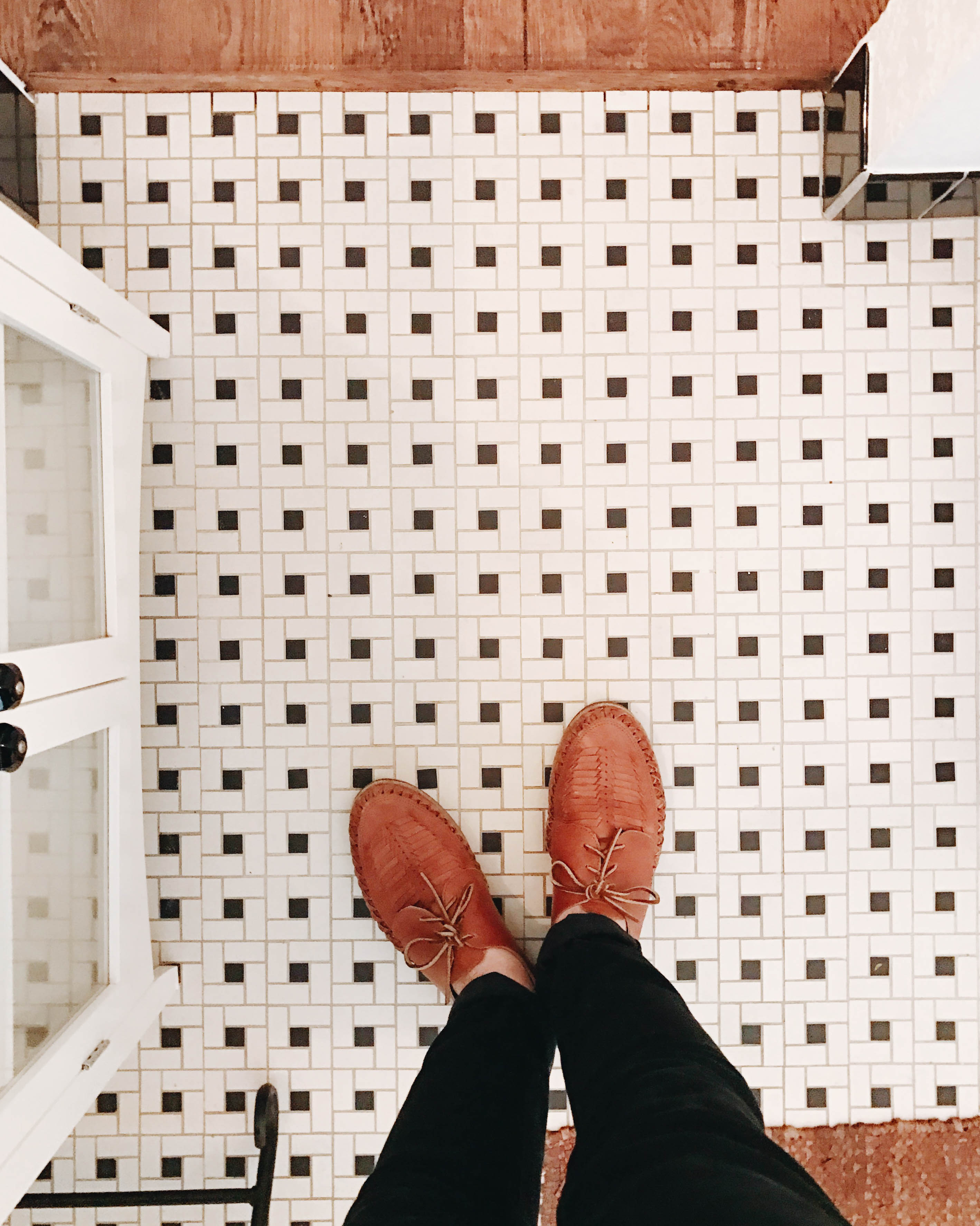
We are getting ready to wrap things up on the master bathroom remodel over here and can’t wait to put the finishing touches on everything. We realized we haven’t shared any of the progress photos we’ve been snapping, and the choices we have made thus far, so why not?! Throughout this whole remodel I thought the changes we were making weren’t that different, but going back through these before photos and seeing the place transform has been really exciting and rewarding.
Click “Read More” to see more before photos and some progress ones too!
TILE
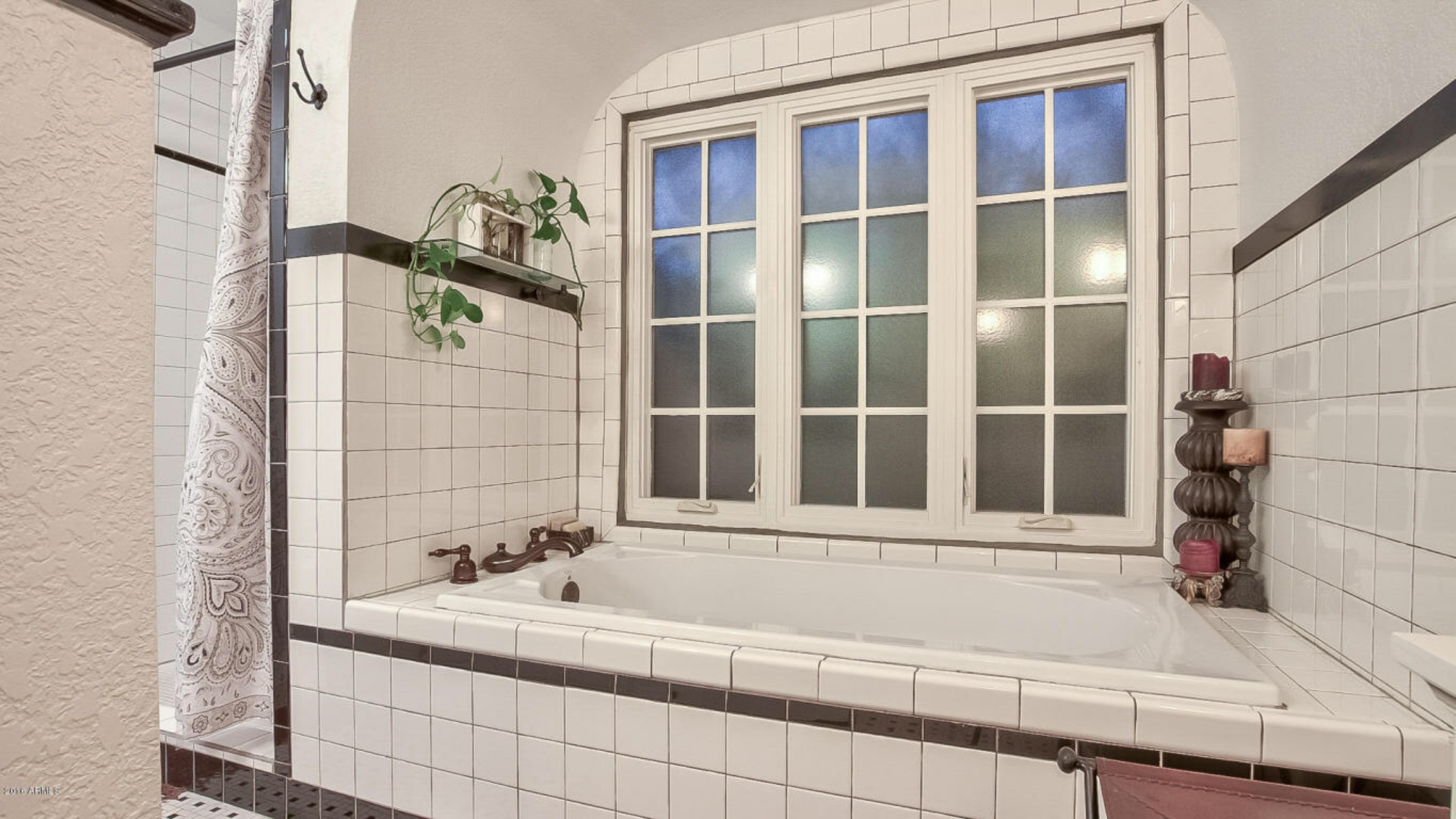
Alright so the before shot (from the listing)…Not so bad at all right? The black and white tiles were a fun nod to the 30s and we loved it so much, we even tried to find similar flooring in the beginning. The more we thought about it, we figured a more modern, black hexagon tile would be a better choice for us.
SHOWER + TUB

Boom! And just like that, everything was gone. This was definitely a fun photo to receive while we were in Paris. Haha. 😉 We didn’t really change the footprint of the bathroom, we just wanted to update the space to make it feel more like us.
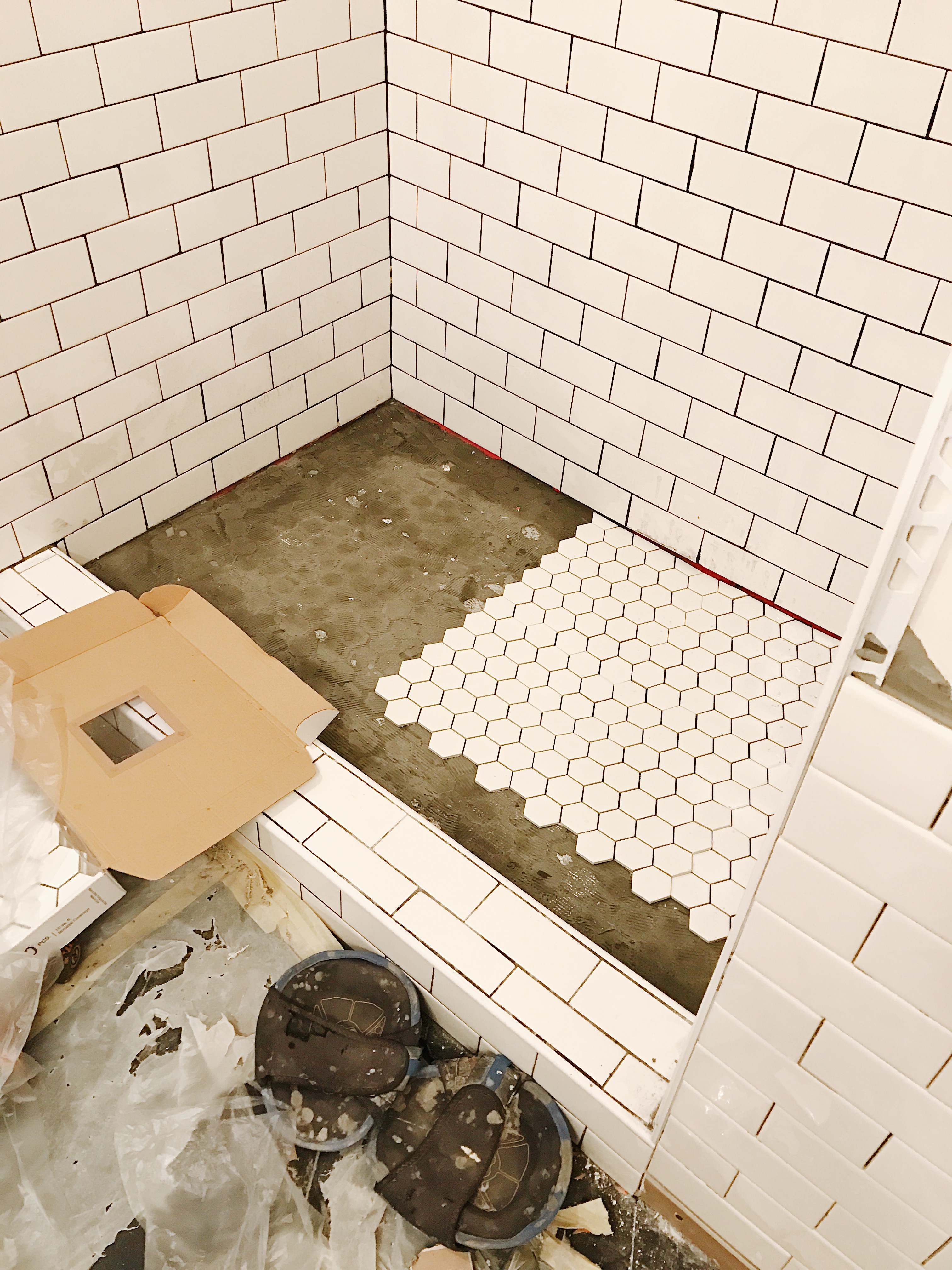
Thankfully we only had two little hiccups with this remodel. The 8″ hexagon tiles were too large for the size of our shower to slope so that the water could properly drain, so we chose a different, smaller scale tile in white, which turned out just fine. At first we wanted to go with marble thinking it would compliment the vanity top well, but once we laid it next to the black tile we realized it looked a little off.
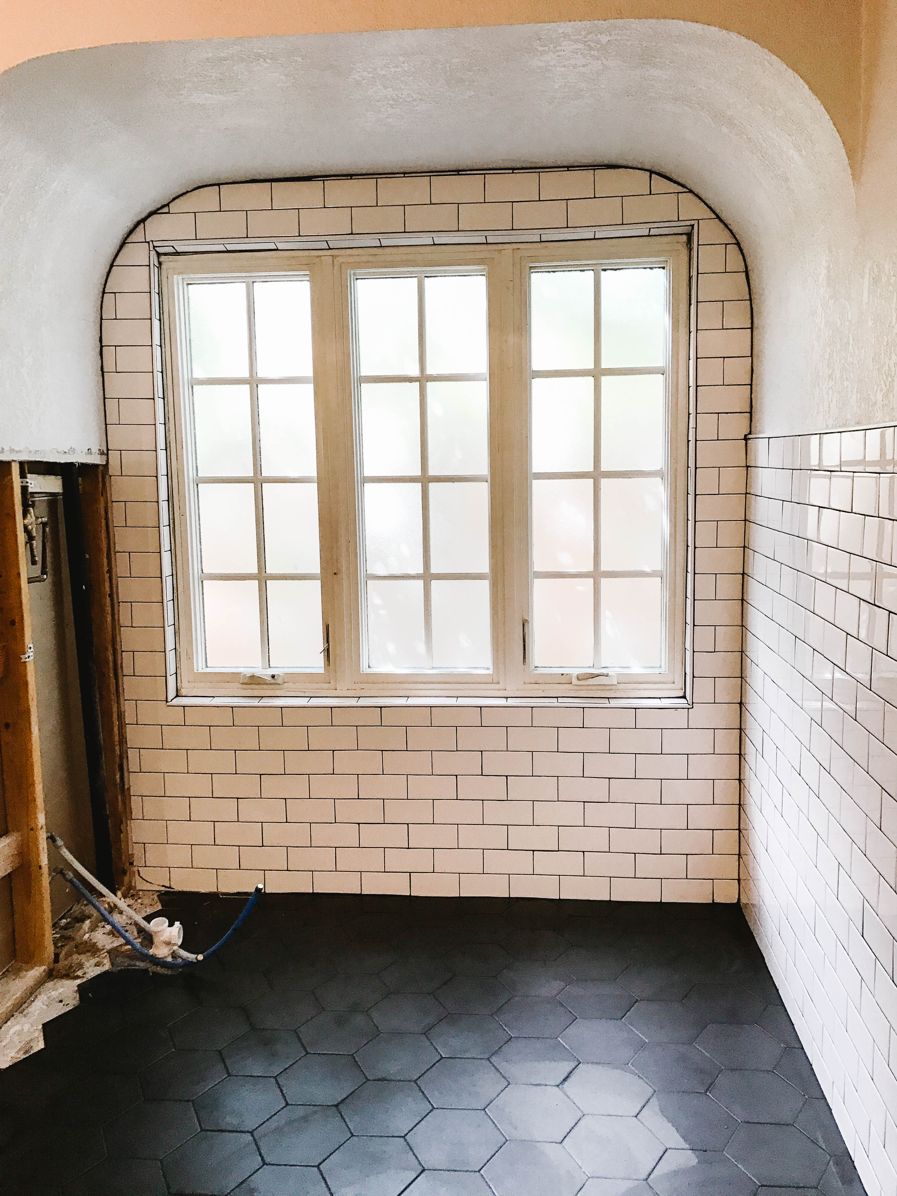
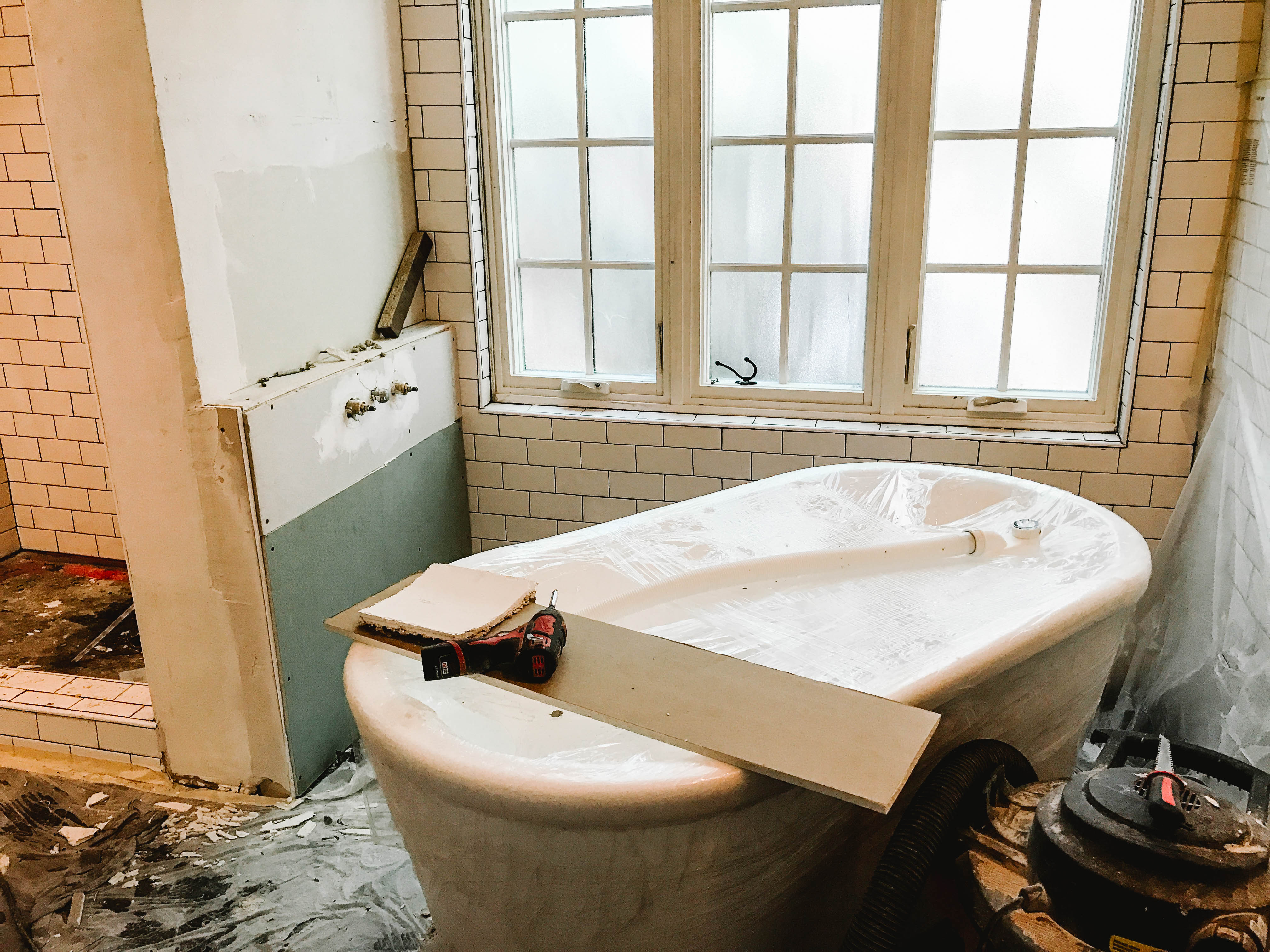
In the photos above you could also see where the old tub was. In that archway, in front of the big window is where the new freestanding soaker tub was placed, but before we could do that we had to play around with the plumbing. We wanted to keep all of our fixtures and trim the same, and the collection we chose did not have a tub filler available in the same finish as our faucets, toilet paper, towel bars, etc., We can kind of be a stickler for things like that, so we went for wall mount knobs that would be placed on the wall behind the shower head. In order for the tub to be centered on the window, we created a little ledge where the plumbing was nestled in, which actually ended up working out well giving us more room for bath goodies, body products, etc. in the end. You can see a progress photo of that below. That whole area will be tiled as well.
VANITY AREA
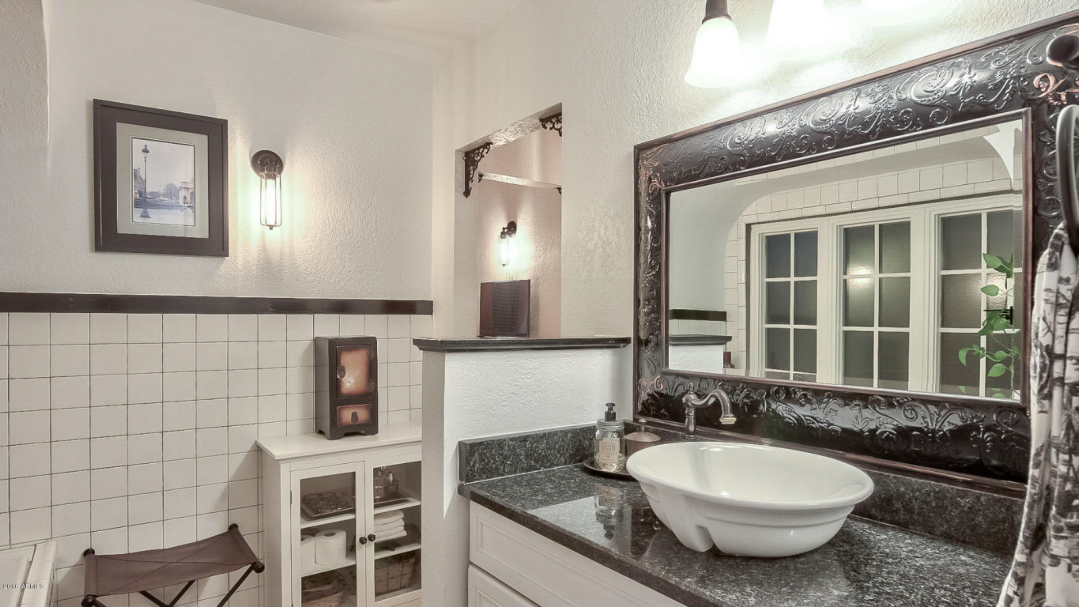
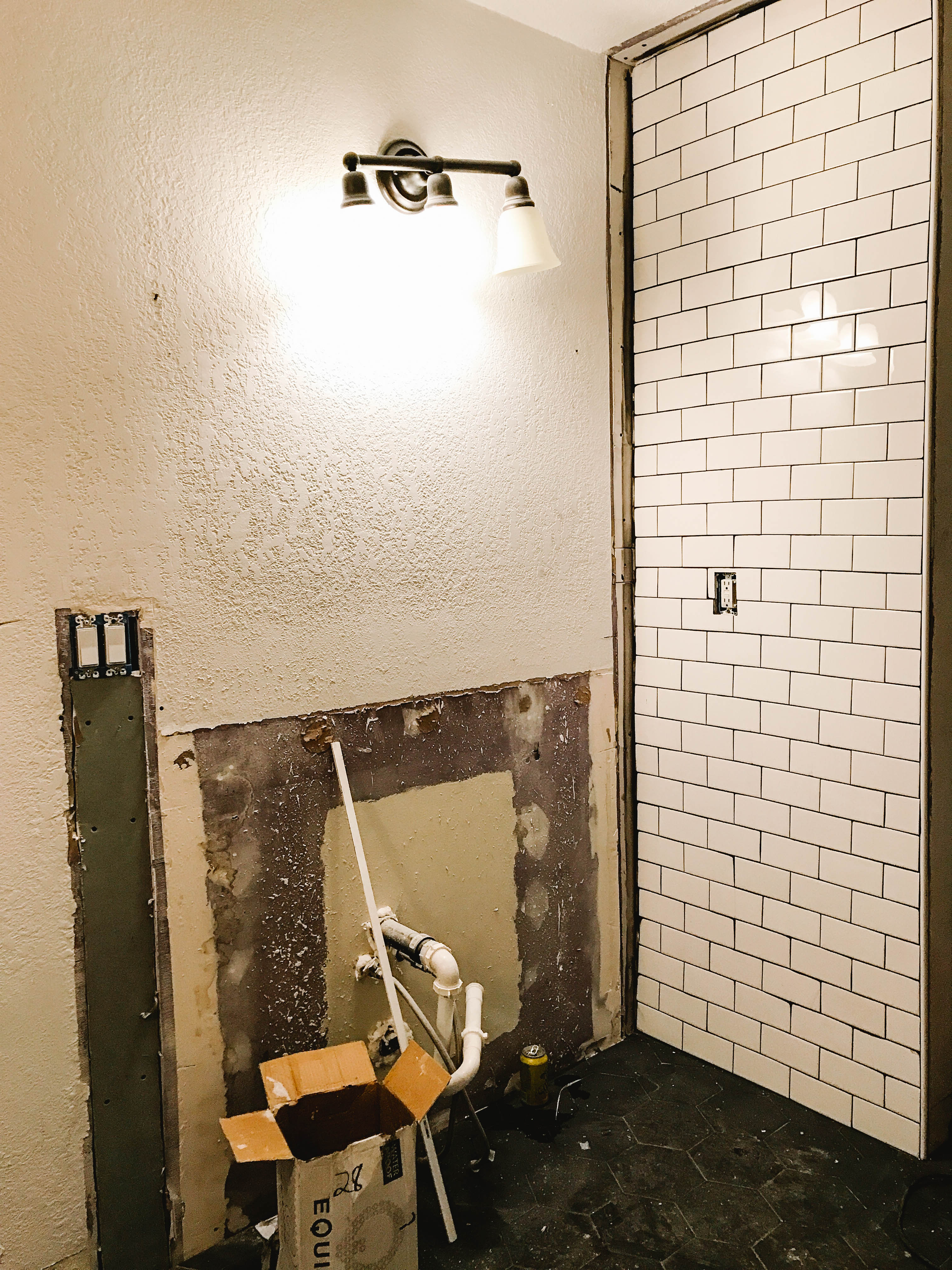
The first photo of the vanity area is another listing photo. As you can see the previous owners did an awesome job utilizing the space and it clearly drew us in to the house, but there were definitely a few things in this area that we knew would be more functional for us, beginning with getting rid of that half wall. Adios! Next, we decided to shave down the privacy wall (on the right in the photo above), which hides the toilet. This allowed us to get a double vanity to fit in the space, which is a major plus when you’re sharing a bathroom with your spouse. Am I right? 😉 New light fixtures and smoothing out the walls to remove the texture came next.
That’s about all for now. We’re looking forward to sharing some room reveals over the next few weeks, so keep your eyes peeled.
To see the full master bathroom plan, click here.
Also, if you’re interested in what we’ve been pinning for inspiration, follow along with us on Pinterest.


half walls! why?! they seem unnecessary 95% of the time! i’m so excited to see how that tub area looks after it’s done!!
Haha right?! We feel the same way. Can’t wait to share more on the space. 🙂
Ugh we just bought a house FILLED with awkward half walls. Can’t wait to knock ’em down!
I like those 30s style tiles too, but LOVE the black hexagon tiles you picked out. And that curved archway.. *drool* You guys definitely have a home full of great character!
Thank you so much Angela! That is so nice of you to say!! Can’t wait to hear what you do with your home too! Those half walls are so strange haha.
I am so excited for the final reveal! I worked at a Ceramic and Tile factory and I appreciate a good tile so much more now. Everything looks amazing so far!
We’re almost there! And thank you!! We weren’t sure if the all black flooring would be too much, but we’re loving it so far. 🙂