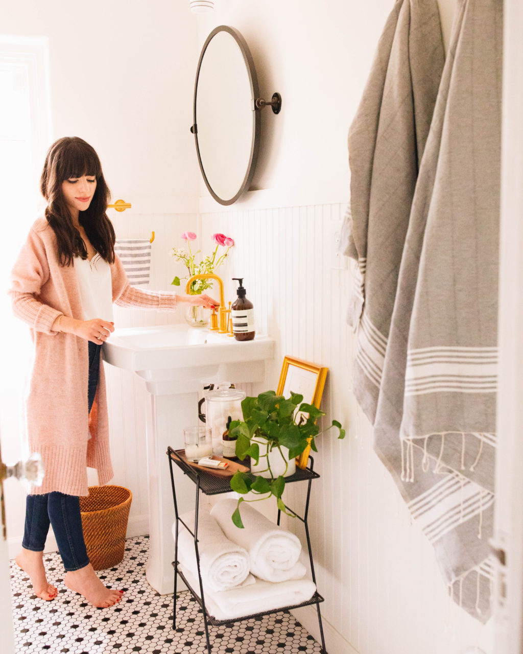
Ever since we’ve completed the bathroom remodels last year (see master bath here, and guest bath here), I can’t get those brushed gold accents off my mind, and have been wondering if I should have done the same toned fixtures in the kitchen as well. We get asked often about the Kohler fixtures we used, so I figured it was time to share a bit more about them along with a couple of upcoming bathroom trends they would fit perfectly in. If you’ve been looking to spruce up your bathroom and have been wondering about which direction to head in, keep reading for some current trends that will stand the test of time.
Bathrooms are some of my favorite rooms to design because they can really set the tone for how you start and end your day….they can be the colorful and fresh space to get ready in each morning, or the calming and neutral place you unwind with some candles, while working through your skincare routine. 😉 For us, its both and they are also the rooms we decided to go a little out of our comfort zone with, matte black tiles in one and a black and white patterned tile in another. With a pop of pattern and some linen accents we created a space that we really enjoy being in.
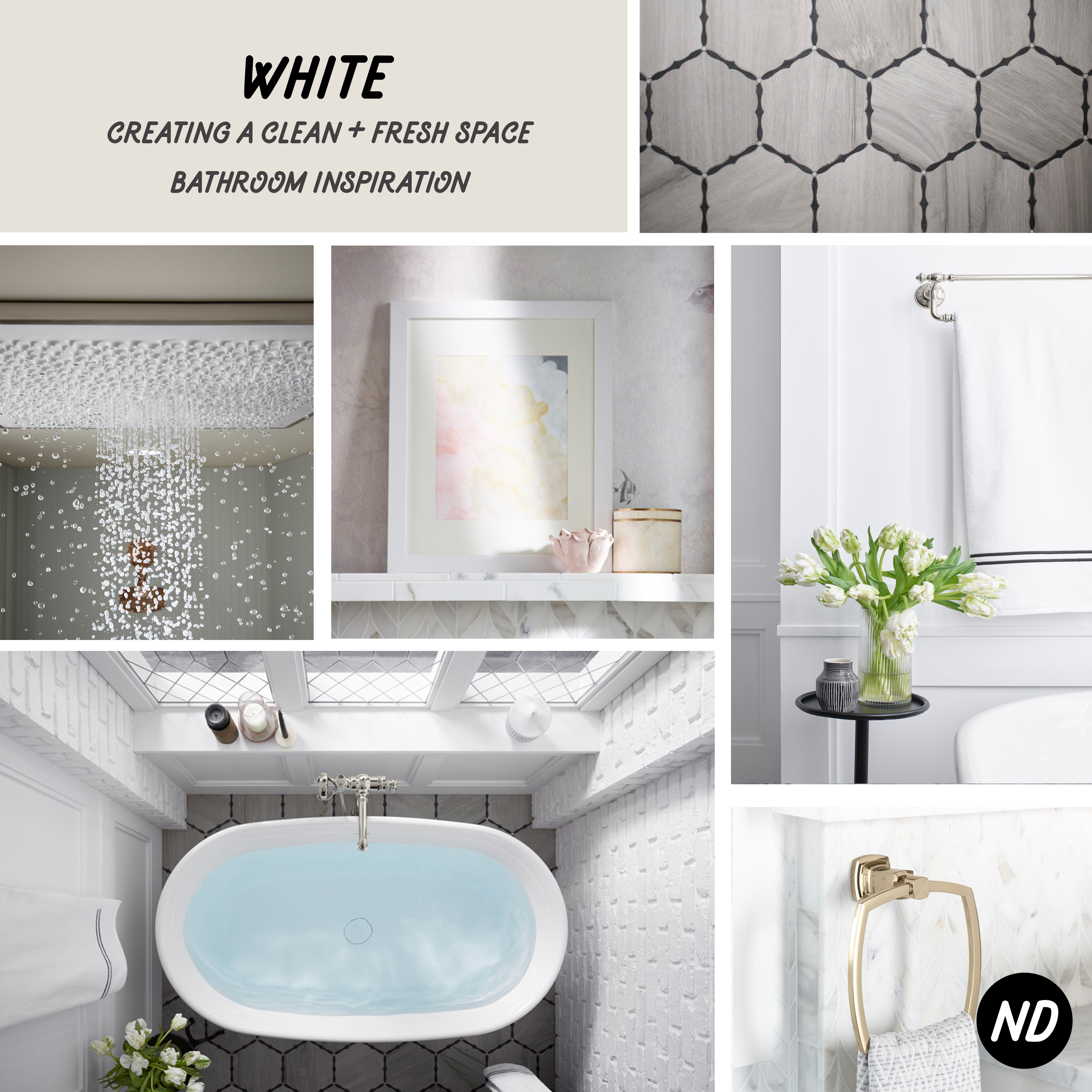 [inspiration photos via Kohler]
WHITE
We knew we wanted to create a spa like experience in our master bathroom, so we began with a white palette in mind. We’re excited to see this on Kohler’s list of design trends for 2018, because fresh white spaces can sometimes be interpreted as boring and get a bad rap. I think as long as you’re infusing some texture and accents that have personality, a white bathroom can turn out very timeless looking, yet still fun.
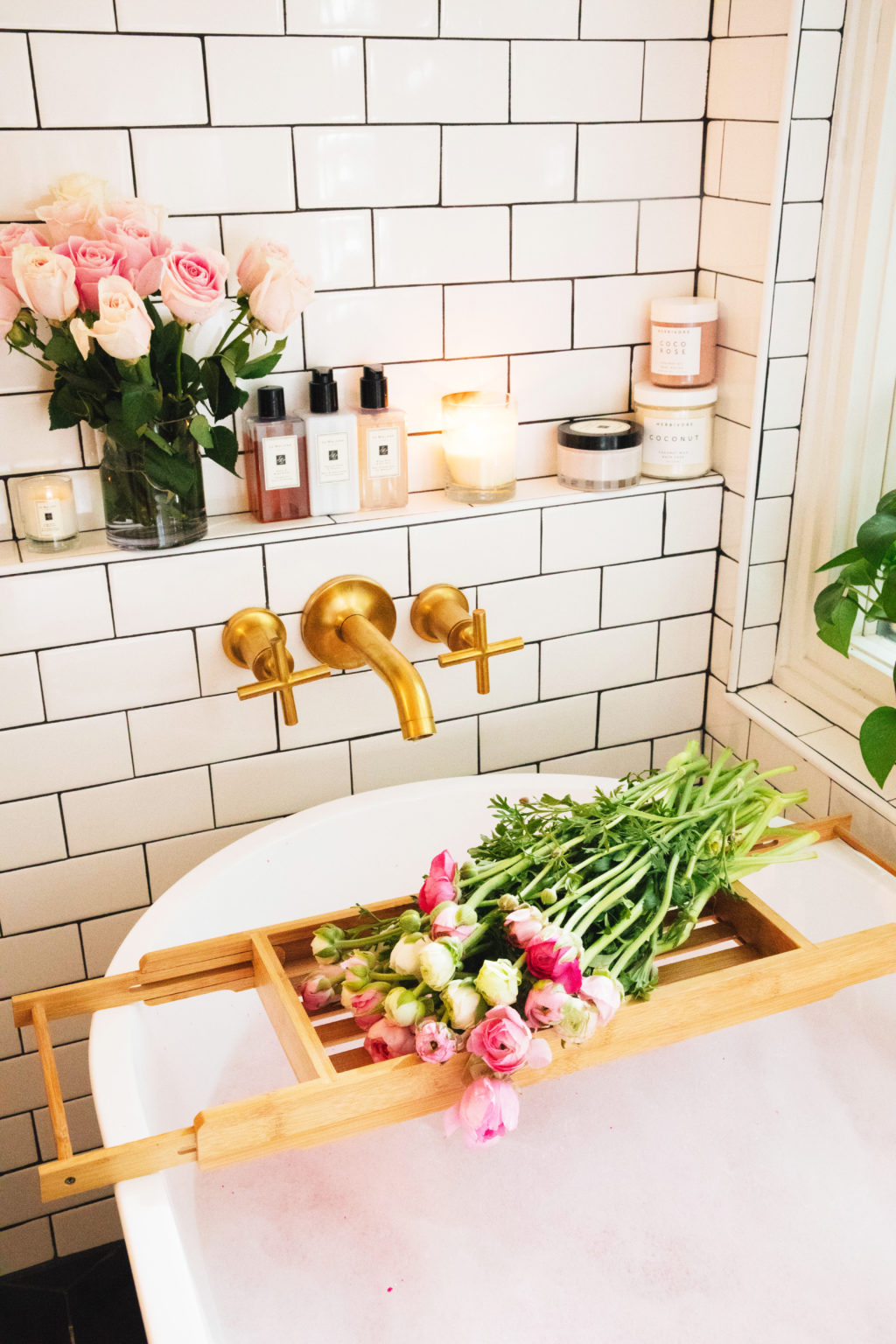
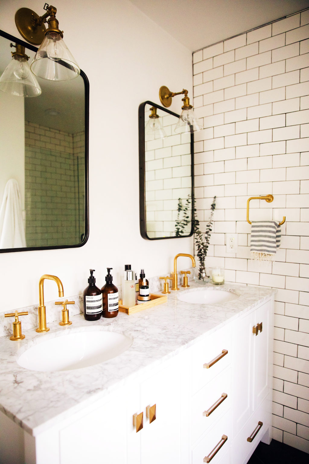
For us, that was mixing white marble with a white vanity and incorporating a large soaker tub into the space. For our “pop” we turned to Kohler’s Purist line with brushed gold accents and lighting. It was hint of vintage charm we love, while still keeping things fresh and modern. Black and white can lean very cold, but this fixtures and use of texture created the sense of warmth the space needed.
Here are a few of our favorite combos for that fresh white bathroom look:

faucet | tile | vanity | lighting | mirror

faucet | mirror | tile | shower fixture

faucet | backsplash option 1 | backsplash option 2 | lighting | vanity
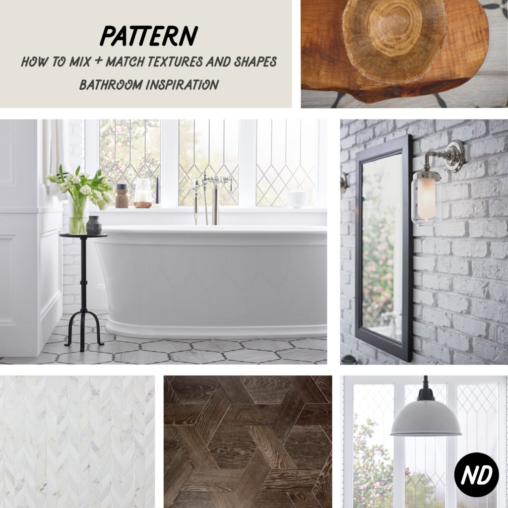 [inspiration photos via Kohler]
PATTERN
Although we wanted to concentrate on a clean and fresh white space for both bathrooms, we still wanted to add some personality and have the eye be drawn to something when walking into the rooms. As people who love rooms with minimal decor and almost no clutter, often being drawn to a blank slate, infusing something eye catching or an accent piece can sometimes be difficult for us. Consider it our fear of commitment in design. For both bathrooms we found ourselves infusing that eye catching element in the form of a geometric pattern, specifically the tiling.
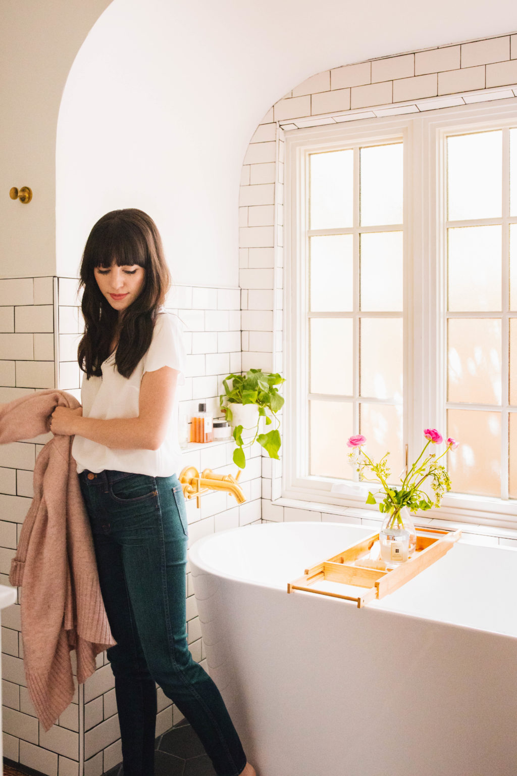
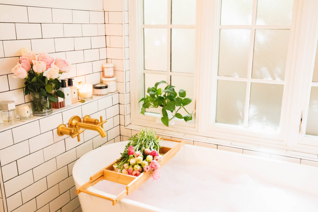
For both bathrooms we embraced pattern with a minimal mindset. Still sticking to our black and white theme, we went with a large black hex tile in the master bath, with a contrasting white subway tile on the walls and in the shower. The matte floor tile was a bit hard to find in stores, so we ended up ordering it online from Wayfair which also had those amazing Kohler brushed gold accents — woot woot. Mixing the geometric pattern with the curves of the faucet and organic shape of the modern soaker tub, created interest in a minimal, clean way.

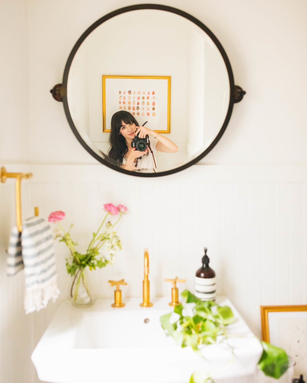
We played with pattern and scale again in the hallway bath, with a small black and white hex tile. This popped against the texture of the white headboard on the walls. We wanted the bathrooms to feel cohesive (thats where those brushed gold accents came into play) and part of the same house, yet not exactly the same. I think we were able to give the hallway bath a modern twist with the use of scale and adding new fixtures to the existing pedestal sink, that is a sweet little reminder of the original charm of the home.
Here are a few of our favorite combos that infuse pattern while still staying minimal and clean:


faucet | tile | vanity | drawer pull

faucet | tub | tile | lighting
*This post was made in partnership with Kohler. As always, all thoughts & opinions are our own.

